Trade Show Design Secrets: A Brilliant Back Wall
I attend a lot of trade shows. The exhibits are cluttered and sometimes overwhelmed by banners. There is so much stuff that nothing stands out. Most exhibits have no drama. The few that stand out often have brilliantly designed back walls.
 When I design an exhibit, the first thing I think about is how to make a big, powerful graphic statement. For small- to mid-sized booths, it often comes down to creating a brilliant back wall and making it the focal point of the entire exhibit.
Here are a few tips for a brilliant back wall
- Make a color statement: Use bright colors and a limited palette. Generally, feature two or three colors. If you are using color photography, select or modify photos to create a focal color.
- Keep it simple: Make the design visually arresting but simple.
- Eliminate clutter: Do not put anything on or in front of the back wall that isn’t essential.
- Integrate everything with the back wall: Make sure that the other components of your exhibit are compatible with your back wall. If you have a small exhibit, look for ways to incorporate displays, storage, literature racks and even video monitors into your back wall.
- A back wall does not need to be flat. Incorporate curved panels and other 3-D elements into your back wall to create the illusion that your booth is bigger than it really is.
- Fill it with products: Incorporate displays, clothing racks and product showcases to make your back wall more than a graphic backdrop.
- Add unusual materials: Some of the most eye-catching back walls incorporate live plants.
- Lighting really matters: Use backlit signs and displays, pinpoint spots and other light effects to create visual interest and highlight the most important graphic elements of your exhibit.
Nothing about your exhibit should be ordinary but an ordinary back wall is a big missed opportunity.
Your trade show exhibit is like a billboard
There are a lot of similarities between a trade show exhibit and outdoor advertising. You are located on a pathway and people are racing by. They glance to the left and to the right. They have a lot of other things to look at. You only have a few moments to attract their attention.  The challenge is very similar to designing a billboard to be placed on a busy Interstate highway.
The best billboards evoke an emotional connection.
They are usually entertaining and often use humor. To be effective billboards must be short, sweet, simple and to the point. Not surprisingly, many of the “rules” for great outdoor advertising design translate to the trade show floor.
- Be relevant or your exhibit will be invisible. Make sure your ads appeal to your target market. Use colors, images and words that will attract them and draw prospects into your exhibit.
- Bright and bold colors are more effective. Bright colors work well, but limit your pallet to two or three at most. Exhibits with multiple bright colors are visually confusing and that reduces the overall effectiveness. Even if you are marketing natural and “green” products, consider using clean blue or bright white rather than the more expected green-brown palette. Green and brown are very likely to recede into the background and have little visual impact unless you compensate for the color palette with other design elements.
- Visibility matters. Make your major exhibit graphics large enough to be seen quickly and from a far distance.
- Use words sparingly and make them easy to read. Use large, legible type. The best bet is solid backgrounds with sharply contrasting type. And unless there is a compelling reason for vertical type, orient your type horizontally – it is easier to read.
- Choose graphics that connect with your target. Select images that will generate the strongest emotion related to your product or service.
Trade Show “Power Graphics”
Graphics are a critical element of any trade show display. You could have the best promotion, best product and brilliant people in your booth but, if most attendees don’t notice your exhibit, it won’t matter.

There are many philosophies about how to create effective trade show graphics that persuasively break through the clutter. One solution is “Power Graphics” – singular images that have the “power” to make your exhibit stand out from your competition, attract your target customers and almost instantaneously communicate your key message.
What makes graphics powerful? Graphics that are singular and focused have power. Images and words combined to communicate your message and brand personality without needing translation have power. Graphics without unnecessary elements in the design, displays and sales presentations so that your target customers can actually experience your message, your brand and your products are the most powerful.
The images and words that you use depend on your marketing message but here are a few general guidelines:
- Make sure your designers know everything that is important about your target customers – before they start work.
- Select a design team that knows how to design exhibits. This is a unique design task and many great advertising designers have little experience with or understanding of trade shows.
- If one image will communicate your message, don’t be afraid to let your designers build the exhibit around that one key image.
- Keep it simple and uncluttered. The details belong in your sales material, presentations and interactive displays.
- Make sure the key graphic can be easily seen from a distance. Avoid small or overly detailed images.
- Think in 3-dimensions. Dimensional graphics create visual interest.
- Incorporate words – in large, legible type. The most memorable images are often the combination of a few words and a graphic image.
- Use lighting to make the “Power Graphics” the focal point of the exhibit.
- Avoid commonplace and generic images, for example, photographs of happy customers, standard product photography and stock photography that looks like stock photography.
Effective use of “Power Graphics” can make a meaningful difference in your ability to get the most out of trade show participation.
Tips for Designing Effective Exhibit Graphics
Exhibit design is a powerful reflection of your brand and, in fact, part of your branding. Trade show booths involve your company logo, products and employees. They serve as giant, interactive business cards.
So, even if you’re not making a huge investment in exhibit design, it’s worth revisiting the core elements of your branding to make sure all the pieces of the puzzle fit together. Here, we’ll take a quick look at graphically and lyrically spicing up your exhibit booths.
Trade Show Graphic Design
A competent exhibit company should be able to provide you with exhibit designs that effectively communicate your brand. You may even wish to incorporate into this process your in-house or consulting graphic designer.
- Embrace your three-dimensionality. Most of your branding materials are probably flat, “conventional” pieces. Graphic designers jump at the opportunity to work with exhibit designers to breathe fresh life into larger, 3D displays.
- Maintain focus. While it’s tempting to incorporate every bell and whistle within your budget, visitors will lose interest quickly if they can’t figure out what’s going on. Speak to your specific offerings and value-added features relatively early in the engagement process.
- Consistent with the 3D theme, reach out and grab your audience’s attention. You’re not only trying to engage people at your booth but those down the aisle and across the room.
Trade Show Custom Copy
 A bit more innovation is possible with your written materials than with your brand graphics. While you can’t and shouldn’t change your logo for every trade show, show-specific copy is an excellent idea.
Written materials can be customized–partially, at least–for each trade show you participate in. Keep everything as short and concise as possible. Making sure that the information is timely will help you to stand out from the crowd, especially if your competitors’ materials have gone stale. Engage your customers and support your sales and marketing strategies with a custom trade show booth.
Design Effective Tradeshow Graphics and Maximize ROI
Graphics Are the Most Important Design Element of Your Trade Show Display
For the vast majority of tradeshow displays, the graphics are the most important design element. No matter how beautiful a display is, if you hang poorly designed graphics on it, it just looks awful. And attractive graphics aren’t enough – they must be effective as well if you want to get the maximum ROI on your tradeshow dollars. In order to get the best graphic design results, you should start by carefully considering your objectives and how your tradeshow display’s graphics might help you achieve them.
 Too often, companies choose to just blow up their logo and a few of their magazine ads or a page from their website, stick them on the backwall and call it a day. People who view a web page or magazine ad spend considerably more time reading and also expect to get complete information from this type of graphic. Tradeshow graphics, on the other hand, need to be read and understood in the 3 seconds that it takes an attendee to walk past your booth.
Let’s consider the graphics on a standard 10-foot backwall display. The normal way to arrange graphics is to put your company’s name and logo on a large sign at the top. This is just fine if your company is Coca-Cola, or Nike, but lesser known brands might want to add a few words that describe what the company does or maybe a bold statement that grabs the attention of the visitor.
Design Graphics to Support Your Sales Presentation
The balance of the graphics in a small booth can be used to create an atmosphere, list features and benefits of products or show products in use. I prefer to design graphics that support a sales presentation. Once a prospect has stopped at your booth, the booth staff can easily do a brief sales presentation using the graphics as visual support.
Once you have established your objectives, it makes sense to take advantage of the experience an exhibit designer brings to the table. Share with them your goals and allow them to provide input on graphics that are going to be displayed.
Signage at Tradeshows: How Big is Too Big?
All companies that exhibit at tradeshows want their name to be the most prominent in the convention center. At large shows with hundreds of exhibits this is obviously not possible. When you walk into the exhibit hall, you are confronted with sea of visual clutter. So what is the correct approach to signage in your booth?
Consider this:
Exhibit signage breaks down into 3 basic categories, long, medium and short range graphics. Each of these categories serves a practical purpose.
Long Range Graphics
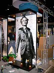 These are most often corporate identification graphics. In island or peninsula displays, they can be large signs that are placed at the maximum height allowed by the show. They are sometimes suspended from the convention center ceiling (where permitted) or can be supported from the floor on tall columns. The purpose of long range graphics is to allow visitors to locate your exhibit from the entrance of the hall or at least from several aisles away. Most companies want these signs to be as large as possible, so they can’t be too big. When every exhibit has these large signs, they lose their effectiveness. Sometimes adding lighting or rotating the signs will add interest. These types of signs are generally not permitted in backwall displays.
Medium Range Graphics
As visitors get closer to your exhibit, it is important to show them who you are and what you do. At 20 feet away from an island booth, the visitor would need to look straight up to read your large overhead sign, so medium range graphics should include your corporate identification. Individual product names and informative tag lines are appropriate at this level. In smaller displays, medium range graphics are the only corporate identification and should clearly state who you are and what you do. Medium range graphics should be large enough to be read from a reasonable distance but not too large to interfere with the exhibit design. They should be positioned at or just above eye level.
Short Range Graphics
Signs of this nature include any graphic that can only be read while standing in or very near the display. They usually include product or brand identification signs and can include more detailed information since you are conveying information to interested attendees, not trying to lure them to your display. Features, benefits, specifications and installation examples are perfect for short range graphics. These signs do not need to be very large and should be placed just below eye level for ease of view.
While these are very basic guidelines, they will result in well-designed, effective and cost effective exhibits.
Need a unique and effective tradeshow booth idea? We can help you create a custom trade show exhibit that creates a buzz about your brand and increases your booth traffic, all within your budget. Let’s Talk.
Why You Should Replace Traditional Graphics With Flat Screen Displays
Situation: You are getting ready to exhibit at your most important show of the year. You pull your exhibit out of the warehouse and realize that the graphics and entire exhibit looks outdated and tired. You need to update, but your budget is limited. You can’t afford to replace your entire trade show booth – you can’t afford to fade into the background at this show.
One Solution: Replace your exhibit graphics with flat screen display monitors and a media player.
There are many ways to update and refresh an outdated trade show exhibit. Increase booth impact by replacing graphics with digital displays will add a high-impact look to your display and help bring it up to speed with newer, more high-tech exhibit properties.
Converting your graphics to flat screen digital displays can involve greater up-front costs than just replacing the graphic panels, but you will be building longevity and flexibility into your exhibit. Plus, adding digital display monitors has other benefits:
- You may be able to save on graphics production unless you create very elaborate digital presentations.
- You can create attractive dynamic signage that will attract attention and draw more people into your booth.
- You can quickly update your messaging by creating new content.
- You can affordably adjust your brand presentation and featured products for each show’s specific market.
- You can create presentations that will help customers visualize what you can do for them.
Updating your trade show booth with digital display monitors and a dynamic presentation can help you attract trade show attendees and encourage more of them to buy your products or services.
Need help with updating your trade show display? We can help. Let’s talk.
Archives
- July 2025
- July 2021
- June 2021
- May 2021
- April 2021
- October 2018
- September 2018
- August 2018
- July 2018
- June 2018
- May 2018
- April 2018
- March 2018
- February 2018
- January 2018
- December 2017
- November 2017
- October 2017
- September 2017
- August 2017
- July 2017
- June 2017
- May 2017
- April 2017
- March 2017
- February 2017
- January 2017
- December 2016
- November 2016
- October 2016
- September 2016
- August 2016
- July 2016
- June 2016
- May 2016
- April 2016
- March 2016
