Trade Show Design Secrets: A Brilliant Back Wall
I attend a lot of trade shows. The exhibits are cluttered and sometimes overwhelmed by banners. There is so much stuff that nothing stands out. Most exhibits have no drama. The few that stand out often have brilliantly designed back walls.
 When I design an exhibit, the first thing I think about is how to make a big, powerful graphic statement. For small- to mid-sized booths, it often comes down to creating a brilliant back wall and making it the focal point of the entire exhibit.
Here are a few tips for a brilliant back wall
- Make a color statement: Use bright colors and a limited palette. Generally, feature two or three colors. If you are using color photography, select or modify photos to create a focal color.
- Keep it simple: Make the design visually arresting but simple.
- Eliminate clutter: Do not put anything on or in front of the back wall that isn’t essential.
- Integrate everything with the back wall: Make sure that the other components of your exhibit are compatible with your back wall. If you have a small exhibit, look for ways to incorporate displays, storage, literature racks and even video monitors into your back wall.
- A back wall does not need to be flat. Incorporate curved panels and other 3-D elements into your back wall to create the illusion that your booth is bigger than it really is.
- Fill it with products: Incorporate displays, clothing racks and product showcases to make your back wall more than a graphic backdrop.
- Add unusual materials: Some of the most eye-catching back walls incorporate live plants.
- Lighting really matters: Use backlit signs and displays, pinpoint spots and other light effects to create visual interest and highlight the most important graphic elements of your exhibit.
Nothing about your exhibit should be ordinary but an ordinary back wall is a big missed opportunity.
Break All the Rules with Your Trade Show Exhibit Design
There are times when the best way to make a visual statement is to break all the rules.
 The “normal” best practice for trade show exhibit design is to make the color scheme consistent with the company’s brand ID color palette. Since so many companies’ color palettes are blue or red, many trade show floors are dominated by the primary colors – blue, red and yellow. If there are “green” products at the show, then add in some green-brown natural-colored booths to the mix. Breaking out of this pattern can make your booth stand out.
Creating a monochrome exhibit is one rule-breaking strategy that can be brilliant if it is well conceived and carefully designed – or a dismal failure if it is not executed flawlessly.
A monochrome color scheme is created in different shades of a single color. If a monochrome display incorporates dramatic shapes, lighting and/or carefully planned contrasting elements, it can be the most memorable exhibit of the show. But if there are no other design elements to create visual interest, it can be boring and attendees will just pass you by.
Does “monochrome” suit your company’s brand personality and product?
A monochrome color scheme is great to use when innovation is a core part of your brand personality. It can be effective for positioning fashion-forward design and high-tech products but is inappropriate for most financial services, insurance, and healthcare products. It is also usually a poor choice if your company is known for products with a wide range of colors – whether it is fashion or candy or stock photography. But if a monochrome color scheme does fit your brand personality and your product, it can be a big win. For example, if you are promoting a new kind of pure water filtration system, then a completely clean, blue exhibit can make a bold statement about both your company and its products.
Will a one-color display stand out?
You want your trade show exhibit to stand out from a distance. Think about what other exhibitors are likely to do. To create visual impact with a monochrome exhibit, it is essential that it is a singular experience on the trade show floor. So if your designer proposes a monochrome exhibit, make sure that the approach is original. One entirely white exhibit could be exciting – two white exhibits are almost guaranteed to be boring.
Consider the scale of your exhibit
A monochrome color palette is most effective for mid-sized and large exhibits. In a small exhibit space, this is not often an effective design approach.
Incorporate other distinctive visual elements
When you limit the color palette to one dominant color, it is essential to compensate with other design elements that add visual interest. You can incorporate one bold graphic element that is the focal point. You can use dramatic lighting to add dimension to the visual presentation. You can incorporate distinctive display components into the display.
Monochrome trade show exhibits are rare, but when executed brilliantly, can be the most memorable exhibit on the trade show floor.
Trade Show Exhibit Design Secrets: The Star of the Show
Your trade show exhibit should be designed to focus on your products, not your display. This doesn’t mean that the graphics need to be subdued or your booth needs to be boring. It means that the graphics, colors and lighting should be integrated to draw attention to your product.
Make your products the star of your trade show display
Don’t be afraid to be bold. Use high-impact colors that will stand out at a distance. A bland  color palette will blend into the background and not draw attention or focus the audience on your product.
Be brand-true. You should support and build on your brand campaign. But your exhibit also needs to go beyond the brand message and convey what your company is about.
Use exhibit graphics to draw in high-potential prospects for your product. People can “read” images faster than they can read words. Use images to clearly define what your company does and to attract your target customers. Images are also an effective way to filter out people who are not likely buyers so that they do not take up your staff’s valuable trade show time.
Limit your product display to focus on signature products. No matter how large your trade show exhibit space is, it is easy to dilute the overall impact of your display with visual clutter from too many products. If you want to tell an assortment story, organize your products into groups. Trade show attendees are most interested in new products and your most important products. You can use collateral materials or electronic product directors to provide information on your full product offering.
Use lighting to spotlight what is important. Lighting can accentuate the most important information and make your products stand out. Be creative in how you use lighting to draw attention to your products. Backlighting graphics, for example, can increase initial awareness and recall of your exhibit.
The design of your trade show display can draw attention to your product. The right graphics, colors, and lighting can grab the attention of your best prospects and make your trade show exhibit a true product showcase.
Create Exhibits with Curb Appeal
Trade shows are by nature quite chaotic. Attendees bustling from booth to booth while exhibitors fight to garner their attention and interest in their companies’ products or services. Studies have shown that a tradeshow display typically has about three seconds to catch the attention and communicate to a potential customer passing by a booth. To makes things even harder, your booth is competing with possibly hundreds of other displays for attendees’ attention.
 So, exhibitors have a matter of seconds to grab attendees’ and potential prospects’ attention and make an immediate impression. Eye-popping, colorful graphics in tradeshow booths are an excellent way to do just that. Graphics in tradeshow booths can include booth signs, displays, banner stands, and even table cloths. So what makes one booth an attention-grabber and another one that’s easily passed by?
Here are some things to think about when you set about creating the graphics that will hopefully deliver a powerful visual punch and grab the attention of potential prospects.
Pick a good color. The right color can help you both convey a message and stand out amidst the sea of competing booths. Warmer colors, such as red, orange and yellow attract more attention than cooler colors, such as blue, green and white.
Keep images simple. Simple, bold and clear images are the most effective in conveying your marketing message to attendees. The more ornate and involved the graphics, the more you risk confusing, overwhelming and distracting booth visitors. If possible, choose just one simple image.
Headlines are key. So put a lot of thought into writing them! Choose your words very carefully and keep it simple, clear and short. This might be the only shot at grabbing the attention of attendees who are giving your booth at most a passing glance. A crafty, compelling headline may be what brings them in to hear more about your company. Also the shorter the headline, the bigger it can be, increasing visibility.
Keep it light. Lighting is very important to helping draw the attention of attendees and in creating a welcoming atmosphere. Be creative with lighting; choose to spotlight a new product or use warmer lighting to create an inviting environment.
Choose a message that packs a punch. This is a tough one. You already know you have to keep it short and sweet with simple imagery. The things that you must communicate are: who you are, what your business does, and what separates you from your competition.
Signage at Tradeshows: How Big is Too Big?
All companies that exhibit at tradeshows want their name to be the most prominent in the convention center. At large shows with hundreds of exhibits this is obviously not possible. When you walk into the exhibit hall, you are confronted with sea of visual clutter. So what is the correct approach to signage in your booth?
Consider this:
Exhibit signage breaks down into 3 basic categories, long, medium and short range graphics. Each of these categories serves a practical purpose.
Long Range Graphics
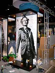 These are most often corporate identification graphics. In island or peninsula displays, they can be large signs that are placed at the maximum height allowed by the show. They are sometimes suspended from the convention center ceiling (where permitted) or can be supported from the floor on tall columns. The purpose of long range graphics is to allow visitors to locate your exhibit from the entrance of the hall or at least from several aisles away. Most companies want these signs to be as large as possible, so they can’t be too big. When every exhibit has these large signs, they lose their effectiveness. Sometimes adding lighting or rotating the signs will add interest. These types of signs are generally not permitted in backwall displays.
Medium Range Graphics
As visitors get closer to your exhibit, it is important to show them who you are and what you do. At 20 feet away from an island booth, the visitor would need to look straight up to read your large overhead sign, so medium range graphics should include your corporate identification. Individual product names and informative tag lines are appropriate at this level. In smaller displays, medium range graphics are the only corporate identification and should clearly state who you are and what you do. Medium range graphics should be large enough to be read from a reasonable distance but not too large to interfere with the exhibit design. They should be positioned at or just above eye level.
Short Range Graphics
Signs of this nature include any graphic that can only be read while standing in or very near the display. They usually include product or brand identification signs and can include more detailed information since you are conveying information to interested attendees, not trying to lure them to your display. Features, benefits, specifications and installation examples are perfect for short range graphics. These signs do not need to be very large and should be placed just below eye level for ease of view.
While these are very basic guidelines, they will result in well-designed, effective and cost effective exhibits.
Need a unique and effective tradeshow booth idea? We can help you create a custom trade show exhibit that creates a buzz about your brand and increases your booth traffic, all within your budget. Let’s Talk.
Why You Should Replace Traditional Graphics With Flat Screen Displays
Situation: You are getting ready to exhibit at your most important show of the year. You pull your exhibit out of the warehouse and realize that the graphics and entire exhibit looks outdated and tired. You need to update, but your budget is limited. You can’t afford to replace your entire trade show booth – you can’t afford to fade into the background at this show.
One Solution: Replace your exhibit graphics with flat screen display monitors and a media player.
There are many ways to update and refresh an outdated trade show exhibit. Increase booth impact by replacing graphics with digital displays will add a high-impact look to your display and help bring it up to speed with newer, more high-tech exhibit properties.
Converting your graphics to flat screen digital displays can involve greater up-front costs than just replacing the graphic panels, but you will be building longevity and flexibility into your exhibit. Plus, adding digital display monitors has other benefits:
- You may be able to save on graphics production unless you create very elaborate digital presentations.
- You can create attractive dynamic signage that will attract attention and draw more people into your booth.
- You can quickly update your messaging by creating new content.
- You can affordably adjust your brand presentation and featured products for each show’s specific market.
- You can create presentations that will help customers visualize what you can do for them.
Updating your trade show booth with digital display monitors and a dynamic presentation can help you attract trade show attendees and encourage more of them to buy your products or services.
Need help with updating your trade show display? We can help. Let’s talk.
Trade Show Exhibit Design: Tension Fabric Displays
Tension fabric displays have many advantages; they are portable, easy to set up, affordable and inexpensive to update. Many exhibitors have switched to fabric graphics because they eliminate the possibility of glare or scratched, marred finishes. Other exhibitors appreciated the contemporary look that can be achieved with fabric graphics. With all the advantages of using tension fabric, it is no wonder that it has rapidly become commonplace. Unfortunately, commonplace can also become boring on a trade show floor.
Designers get creative with Tension Fabric
The typical tension fabric display is constructed of anodized aluminum tubing covered with a stretch fabric that has been printed with graphics. Most often, the exhibits using tension fabric basically replicate traditional trade show display forms. But now, a few exhibit designers are starting to explore the real potential of lightweight framing, tension fabric, programmed lighting and new printing technology to create some innovative new trade show exhibits that were not possible with traditional materials.
Lightweight framing offers new design freedom
The advent of lightweight aluminum framing means that designers can more freely incorporate tall structures and ceiling-hung elements in booths to increase visibility. It also has enabled designers to cost-efficiently create new freeform shapes and elegant, curved structures. These materials offer almost endless shape and size possibilities. Some designers have even created soaring three-dimensional structures that attendees can enter and be immersed in the brand experience.
Fabric graphics offer versatility
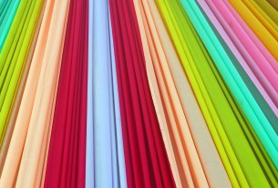 Fabric graphics offer more versatility than laminated panels, and can be produced in varying textures and opacities. Fabrics can be used to add movement and elegance to banners, and hanging elements. And translucent fabrics printed with opaque ink and illuminated with backlighting can be used to add more dimension to the design.
Graphics can be printed on fabric with either a dye sublimation process or a direct ink jet printing process to achieve different effects. Dye sublimation is a continuous-tone printing technology that very closely replicates a chemical photograph and is the best way to reproduce photographs.
Direct ink jet printing produces sharper, brilliant images and is the best choice for highly graphic images. And, with recent advances in high-resolution ink jet technology, high-quality photographic images can be produced with inkjet printing. This printing method can be used on both synthetic and natural fabrics, and allows designers to create fabric graphics on silk, cotton and fabric blends.
Limitless design possibilities
Fabric is a durable, lightweight, versatile, and affordable medium for trade show exhibit design. It provides designers with countless ways to create fresh and up-to-date displays that can make a trade show exhibit stand out at even the most competitive show.
Trade Show Design: Audience Boredom is the Real Challenge
You’re heading to the biggest trade show of the year. You’ve checked out your competition and your exhibit looks as good as theirs looks. You have last year’s team back. Everything will be as good as it was last year. You are ready to make the most the show. But are you ready for the real competition? An audience that is totally and completely bored.
You Have Only a Brief Moment to Make an Impression at a Tradeshow! Attendees Only Recall 15% of the Displays Visited.
 People are surrounded with so much slick mass entertainment, on-demand info, interactive experiences, and noise and hype that they have moved beyond oversaturation – they are now tuning most of it out. Trade show attendees – and your target customers – are a product of this environment. They quickly scan a booth and make a very rapid decision about whether to invest more time or effort in a visit. Now, you not only have to beat your competition, you need to capture the heart and minds of your prospects that are harder than ever to engage.
Studies have found that on average trade show attendees can only recall 10% to 15% of the displays they visited 24 hours later, but the most valuable customers remember over 40% of exhibits even a year later. That is the dilemma – the casual show attendees won’t remember much but do not really matter; the high- value buyers probably remember what you did last year.
You have only one brief moment to make an impression. Do you want your target customers to see your trade show exhibit and think, “been there, done that”? (Don’t forget – your most valuable prospects never miss a show and they saw your booth last year.)
So ask this simple question: When was the last time you changed the appearance of your exhibit?
If the answer is more than two years, pick up the phone and call the best trade show exhibit designer you can find (we can help!). If your booth was typically forgettable, it will look dated. If your booth was the star of the show, it will be unforgettable and remembered as last year’s exhibit. No matter what, a dated exhibit will send the wrong message about your company and the wrong message about how you feel about the attendees of this show.
In this fast-paced, competitive world, trade show visitors want “new”. That doesn’t mean that you need a completely new exhibit, perhaps it just needs to be refreshed. But, now more than ever, it is important to show that your company understands how to succeed in this hyper-competitive marketplace.
DOs and DON’Ts for Effective Trade Show Booths
So in the past few weeks we’ve talked about a myriad of trade show topics: how to entertain attendees, how to develop an effective trade show marketing strategy, tips on how to work your booth, how to reduce costs, and ways to plan before leaving for your trade show. Let’s take a few steps back and determine what are a few of the DOs and DON’Ts of pulling together a successful, enticing tradeshow exhibit.
 Preparing for a trade show, especially for small companies, can be a daunting task. Deciding what to include and how to set up an actual exhibit/display is one of the fundamental decisions you’ll have to make. First step is to contact the show managers and find out the size of the booth you will have, whether there is a wall space for your company sign, if there are electrical outlets available, and any other small items that you might be responsible for supplying.
Here are a few other tips to keep in mind when creating your exhibit:
DON’T overstuff it. Product managers might want to display things that represent every brand or product your company offers. Partners might want their logo splashed all over your booth. Keep in mind that sometimes simpler is better. Booths overcrowded with displays, products, stands, etc., turn off prospective attendees and prevent you from quickly communicating why attendees should visit you.
DO simplify your message. Many exhibitors make the mistake of bombarding their booth visitors with marketing slogans. Instead choose the one core message you want to impart to potential customers and stick to that in terms of graphic presentations. Displaying fewer, but larger visual elements in your exhibit will reduce clutter and better garner an attendee’s attention and create a lasting impression.
DO focus on the cream of the crop. Instead of hauling your entire product line to a tradeshow booth and again cluttering your display, overwhelming visitors, and diluting your marketing message, showcase only your new and top-selling products.
DON’T rely on static displays. Any type of motion captures people’s attention as opposed to static displays. You can take advantage of this by playing a looping DVD on a widescreen TV or make use of a rotating display.
DO maintain a small, private area. If your booth is big enough, it’s nice to have a quiet, private area with a table and a few chairs to take attendees or promising prospects that might like to sit down and discuss your company and its product and services in more detail.
DON’T scrimp on carpet. This might sound silly, but after a long day of walking miles and miles on the unforgiving floors of huge exhibit halls, visitors will appreciate booths that have plush, padded carpet. And, so will your booth workers.
Archives
- July 2025
- July 2021
- June 2021
- May 2021
- April 2021
- October 2018
- September 2018
- August 2018
- July 2018
- June 2018
- May 2018
- April 2018
- March 2018
- February 2018
- January 2018
- December 2017
- November 2017
- October 2017
- September 2017
- August 2017
- July 2017
- June 2017
- May 2017
- April 2017
- March 2017
- February 2017
- January 2017
- December 2016
- November 2016
- October 2016
- September 2016
- August 2016
- July 2016
- June 2016
- May 2016
- April 2016
- March 2016
