Extraordinary Trade Show Displays: How to be Best in Show
The fundamentals of effective trade show displays boil down to your story, your staff, and your execution. Before and during the show, there will be plenty of distractions or gimmicks at other booths, but if you relate to your audience and to the context of the broader show, you won’t get lost in the din of the event.
The Best Story
 The best trade show displays tell a story—your story—clearly and engagingly. Vagaries, misdirection or over-generalized displays won’t do you or your brand justice. You have to assume that visitors have already been annoyed by other booths that take too long to understand. This doesn’t mean that you have to be boring or robotic in presenting your brand, but it should be relatively straightforward for people to ascertain your basic mission and offerings in about a minute. A clear and upfront story buys you time to expound on your latest projects, rather than clearing up confusion over the basics.
The Best Staff
Send some members of your staff around the show floor to explore other trade show displays. In this way, you’re taking advantage of your presence at the trade show by learning things you can only learn by actually being there. Pay particular attention to your competitors, of course. It’ll make the investment in the show that much more valuable.
When you’re knowledgeable about other displays, you can also anticipate visitors’ reactions, preempt their questions and explain how your services are different or superior to those of others on the floor.
The Best Technology
Remember that a trade show is powerful, old-fashioned, offline interaction. Even if you decide to use screens, computers or other gadgetry for demos, the particular presentations should be unique and unlike anything that a visitor can easily view online at home. At the same time, visitors to your display should be eager to go home and check out your site. The show doesn’t end when you pack up the display. If you present yourself right, it’s only the beginning.
Top 10 Tradeshow Display Design Fundamentals
- Study the show’s attendees – know how many are expected and which ones represent prospects for you.
 Know your position in the convention center – the location of your booth as related to the main entrance, the largest exhibits, food and beverage areas or anything else that is likely to impact attendee behavior.
- Think about both long and short range corporate identification – how will prospects find you, and how will they know who you are when they are standing in front of your booth?
- Consider an activity to attract attention – live demonstrations, presentations or other booth activities will cause people to stop and watch.
- Imagine an important prospect approaching your booth – What will they see? How will they be greeted? How much time will they want to spend with you? How will you record their information for follow up?
- Think about the sales process – your booth graphics can be arranged to assist and guide the sales presentation process.
- Consider the image that you want to project – make a list of adjectives that describe your corporate image.
- Think about the practicalities – presentation stations, storage of briefcases, utilities, meeting areas, video, etc.
- Come up with a budget – Not only a number but also what it should include.
- Look for photos – Find some images that are examples of booths you like. Be sure to indicate what it is you like about each particular photo.
Thinking about and preparing these things before you contact an exhibit designer will make the process much easier and more efficient. Best of all, with the right preparation, you’ll end up with a design that fits your style and meets your needs!
Trade Show Exhibit Design: “Think outside the box”
I have a friend who always seems to come up with a new, successful angle for every trade show. Recently, I asked her, “How do you do it?” The simple reply, “I always force myself and my team to think outside the box. I challenge everyone involved to do the unexpected and come up with new ways to attract attention and create excitement.”
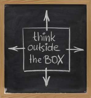 I thought about this advice for a moment. It rattled around in my head. At first, I thought, “I always think outside the box.” Then I started to really evaluate what this common expression means. It is an appealing concept, but is it the right approach for every company, for every brand? And did I really always “think outside the box”? Yes, or at least my goal is always to come up with new ideas and “out of the box” solutions. I just never used that expression to describe my efforts.
What is the “box”?
The trade show’s “box” can be big or small. It can have lighting and dramatic banners. It is the expected trade show exhibit, staffed by smiling people representing a company trying to get leads, offering a free gift or a few samples or some sales material. The box is ordinary, stamped out, one after another just the same in different colors. The box is forgettable.
“Outside the box” exhibits
These are the exhibits that give an attendee a new perspective. These are the exhibits that make lasting impressions on the people who see them. To be effective they require more than just being novel, creative ideas; they need to be thoughtful and suitable for the target audience and the brand. Very few trade show exhibits truly rise to this challenge.
Should every company strive to do the unexpected?
As long as the exhibit is consistent with the brand position and brand values, and successfully promotes your products or services, the answer is, “Yes!” It is a real trick to balance inspiring creative with the hard-hitting sales message that this tough economy demands, but when you achieve it, the results can be stunning.
How to get “outside the box” ideas
The first step in creating a breakthrough exhibit is to build a team that shares that commitment. Once you have assembled that team, make sure that they consistently focus on really solving the marketing challenge that faces you in new and interesting ways.
Break All the Rules with Your Trade Show Exhibit Design
There are times when the best way to make a visual statement is to break all the rules.
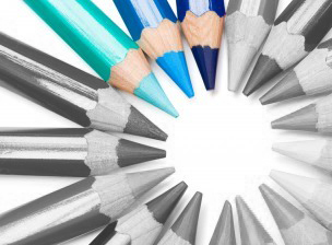 The “normal” best practice for trade show exhibit design is to make the color scheme consistent with the company’s brand ID color palette. Since so many companies’ color palettes are blue or red, many trade show floors are dominated by the primary colors – blue, red and yellow. If there are “green” products at the show, then add in some green-brown natural-colored booths to the mix. Breaking out of this pattern can make your booth stand out.
Creating a monochrome exhibit is one rule-breaking strategy that can be brilliant if it is well conceived and carefully designed – or a dismal failure if it is not executed flawlessly.
A monochrome color scheme is created in different shades of a single color. If a monochrome display incorporates dramatic shapes, lighting and/or carefully planned contrasting elements, it can be the most memorable exhibit of the show. But if there are no other design elements to create visual interest, it can be boring and attendees will just pass you by.
Does “monochrome” suit your company’s brand personality and product?
A monochrome color scheme is great to use when innovation is a core part of your brand personality. It can be effective for positioning fashion-forward design and high-tech products but is inappropriate for most financial services, insurance, and healthcare products. It is also usually a poor choice if your company is known for products with a wide range of colors – whether it is fashion or candy or stock photography. But if a monochrome color scheme does fit your brand personality and your product, it can be a big win. For example, if you are promoting a new kind of pure water filtration system, then a completely clean, blue exhibit can make a bold statement about both your company and its products.
Will a one-color display stand out?
You want your trade show exhibit to stand out from a distance. Think about what other exhibitors are likely to do. To create visual impact with a monochrome exhibit, it is essential that it is a singular experience on the trade show floor. So if your designer proposes a monochrome exhibit, make sure that the approach is original. One entirely white exhibit could be exciting – two white exhibits are almost guaranteed to be boring.
Consider the scale of your exhibit
A monochrome color palette is most effective for mid-sized and large exhibits. In a small exhibit space, this is not often an effective design approach.
Incorporate other distinctive visual elements
When you limit the color palette to one dominant color, it is essential to compensate with other design elements that add visual interest. You can incorporate one bold graphic element that is the focal point. You can use dramatic lighting to add dimension to the visual presentation. You can incorporate distinctive display components into the display.
Monochrome trade show exhibits are rare, but when executed brilliantly, can be the most memorable exhibit on the trade show floor.
5 Ways To Renovate Rather Than Replace Your Trade Show Exhibit
Before you buy a new trade show exhibit, take stock of what you already own and determine if renovation is a better course.
 Rearrange exhibit elements you own to create something new. It is easiest to do this if you own a modular exhibit. But it is possible to switch around parts and pieces of most custom exhibits as well. And don’t forget about unused components that are left over from other old exhibits. Sometimes a combination of parts from two or three booths that have been in storage can be used to create an entirely new booth.
- Refinish or cover worn booth elements. There are countless exhibit refurbishment options. You can have worn aluminum or metal parts re-anodized or powder coated to make them look brand new or transform them into a new color. Exhibit panels can be re-laminated or re-covered to conceal worn surfaces with other materials. You can even have old display panels covered with magnetic graphics.
- Update hardware and lighting. One of the least expensive ways to update your exhibit is to simply update cabinet hardware and replace outdated light fixtures.
- Update the flooring system. You can purchase a whole new flooring system or remodel your existing flooring to create the impression of newness. A new floor can be anything from new, colorful carpet to adding a raised floor.
- Add a few new elements. The most effective way to refresh an outdated exhibit space is to add a few new components —hanging signs and banner, displays, a conference area, desks, You can even incorporate more elaborate tension-fabric structures to revive your exhibit and give it an up-to-date look.
A few smart, simple changes or additions can quickly and affordably give a tired, outdated exhibit a brand new look.
Trade Show Exhibit Design: Motion Captures Attention
Few exhibitors use motion to draw visitors to their trade show exhibit, and this presents an opportunity for the exhibitors who do make effective use of motion. Impactful motion can be created in 2-D with digital video or interactive displays, or in 3-D with people or other moving objects.
Effective 2-D Motion Techniques
 Trade show floors are loaded with digital display monitors but they are rarely used to create motion. Most often they are used to show videos of products, digital slide shows or other programming that is meant to be watched from a few feet away. This can be an important element of a booth but may not draw someone into your booth.
To attract passersby place displays above head level and in a location that can be seen easily from at least 10 or 20 feet away. Using large display screens or an array of displays can help make a big statement.
If you want to attract people with something moving, the programming is what really matters. Program your display with attention-getting video or graphics. Use large graphic images, bright colors, stark contrast and incorporate motion.
Effective 3-D Motion Techniques
A few exhibitors have created trade show exhibits that incorporate the latest 3-D technology, but most 3-D motion elements used in trade show exhibits are people or objects that are in motion.
People are the most common 3-D motion elements. A product demonstration filled with activity and animated behavior attracts attention. A performer doing any kinetic activity – dancing, juggling, walking on stilts, and so on – can attract large crowds.
The other common 3-D motion elements are physical objects that move. A motion element can include banners, streamers or tension fabric structures that are well above eye level and in motion.
Effective Use of Motion
Motion elements are highly memorable and can leave a lasting impression with trade show attendees. The most effective way to incorporate motion techniques into a trade show booth is to make sure that the moving element reinforces the brand identity and the booth concept. As with every powerful communications tool, integration is essential to success and using motion elements as a gimmick just to attract attention without properly integrating the message can actually undermine your overall efforts.
Used wisely, motion can attract visitors to your trade show exhibit and has the capacity to build awareness and leave a lasting impression of your company and brand.
Best Lighting Solutions for Trade Shows
Proper lighting is an essential component of your tradeshow booth and can help increase traffic and create a favorable environment in which to pitch your company’s products. According to booth design expert, Bruce Baker, who’s published articles on booth lighting, a good lighting system that functions at peak performance will boost sales more than any other item you can purchase.
Your lighting requirements will vary depending on your specific promotional goals, display configuration, exhibit color and design, booth lighting fixtures, and space. To determine what type of lighting will best create effective, creative exhibit illumination, you must carefully consider the following questions:
- What area or product in your booth will need to be the focal point?
- What visual impact, impression, or message do you want to convey through lighting?
 When you want to create a spotlight effect to highlight one particular area of interest in your exhibit, you might consider overhead truss lighting. If you’d rather create a more inviting, warm and welcoming atmosphere to make prospects feel more comfortable, you might select a soft lamp or ambient lighting.
Special illumination techniques can be used to create a more dramatic atmosphere that can possibly draw more attendees to your booth by setting it apart from competing booths. Determining the mood you want to create—exciting and dynamic or warm and inviting—will go a long way towards helping you determine the most appropriate lighting.
Other questions to ask when weighing your lighting options are:
- What type of lighting is being supplied by the exhibition facility?
- How much power will be available in your booth?
- Would additional power be available, if your lighting needs require it?
- How are light fixtures attached to your display?
- How much can you spend on display lighting systems?
Once these questions are answered, you can go to your lighting supplier and find the best solutions for your particular needs. Good lighting can lead to increased booth traffic, additional sales leads, and possibly higher resulting sales, so choose wisely.
Top Tactics to Make Your Trade Show Booth Stand Out
Every industry has its norms. At a medical industry show, the show floor will resemble a tranquil sea of blues and whites, colors that convey cleanliness and reliability. At technology industry shows you’ll see lots of bright colors, bold graphics and eye-popping presentations on flat-screen monitors. While every industry has its norm, the reality is that in order to make your booth get noticed by attendees, the last thing you want to do is to blend in with competing booths.
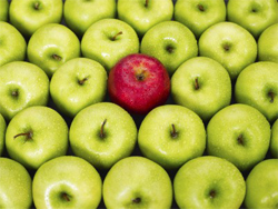 So how do you differentiate your exhibit so attendees will be captivated long enough for your booth staff to engage them and deliver your company’s marketing message? In order to successfully achieve your company’s trade show objectives, whether that is generating sales leads or educating a new market about your products or services, the first step is to garner the attention of prospective customers.
Many companies exhibiting at trade shows make the classic mistake of trying to fit in with other exhibitors. Perhaps it’s your company’s first foray into a particular market or event. You want your company to look like it can play in the same sandbox with other big players in the market. The problem is fitting in isn’t going to help your company stand out amidst its competitors.
Here are a few ways in which you can differentiate your company’s exhibit:
Color: Avoid the standard color palette of the industry. Choosing a unique color scheme for your booth is a simple way to visually set your booth apart from other booths. Be careful, however, and do your research before picking a color scheme. Different colors convey certain messages that might not align with your trade show objectives or your marketing message.
Structure: Be creative here, and don’t settle for a standard exhibit configuration. If your competition typically uses a booth layout with formal meeting areas/rooms, go for a casual lounge feel instead. If competing booths are very geometric and angular, go for a free-flowing, airy feel with a fabric structure featuring organic shapes and soft, curvy lines.
Lighting: One way to breathe new life into an older exhibit is to enhance or change up the lighting scheme. Be creative here as well. Colored lights can add pizzazz and be a real attention-getter. Soft lighting can create a calm, intimate setting.
Product Displays: Don’t overcrowd surfaces with product displays. Again, take note of what your competitors are doing. Use creativity to highlight your products in a way your competitors aren’t. Again, the purpose is to get your booth to stand out so attendees will pause long enough to notice your products and marketing message.
Booth staff: It’s important to put together a “front line” offense when it comes to your booth staff. Don’t staff your booth with temp workers or new employees. Bring out your “big guns,” which typically means your product development folks who can speak at great length—not just about your products, but those of your competitor’s and industry pain points as well.
The Low Down on Trade Show Exhibit Layouts
There are ins and outs and pros and cons to all the various types of trade show booth layouts, and determining which layout will deliver the best results for your company can be a difficult task. Evaluating your company’s needs and objectives will be your first step in determining which exhibit floor plans will work best for you.
 Let’s take a quick look at some of the more popular tradeshow exhibit layouts and the pros and cons of each to make that decision easier. Keep in mind, however, that variables exist between each layout type. Exhibitors can change each layout’s components, size, and positioning and mix and match layouts and elements to suit different situations.
Classic Diamond.
Consists of a large, central structure with a series of independent elements (kiosks, demo stations, graphics, product displays) surrounding it.
Pros: This layout offers a strong visual presence, and its simplicity and lack of walls helps draw in visitors. Also works well for displaying multiple small products.
Cons: The layout’s central structure blocks view across the booth and offers only one spot for a single, high-impact statement or slogan. As far as traffic, this layout requires careful staffing to encourage visitors to explore the whole booth.
Centerpiece.
Typically used when one message or product needs to be featured; all other elements are directed toward one main focal point.
Pros: This layout offers easy access to focal point of booth and offers great impact for main marketing message or slogan. Allows easy access to main focus of booth.
Cons: This layout type offers little flexibility over time and single focus makes it hard to hold attendees’ interest for very long. Central focus of exhibit can attract so much traffic to cause congestion.
Theater.
The underlying purpose of this layout is to show some form of a presentation. Rather than walls, it uses dividers along the sides and demo stations or kiosks along the back.
Pros: Layout drives all attention toward presentation and openness encourages visitors who shun enclosed presentations. Allows strong medium for message delivery and partitions can display smaller, tangent messages.
Cons: Singular focus prevents highlighting multiple products. Offers no capture effect and quick exits after presentations difficult to prevent.
Club.
Also referred to as a closed exhibit, this layout type uses some type of material to create a fully or semi-enclosed environment within the booth space.
Pros: Interior offers quiet off-floor environment and exterior walls can attract attention and deliver messaging. Allows complete control over entry and exit of visitors. Exhibit walls offer lots of space for graphics.
Cons: Attendees can’t see main focus until they step inside and limited entrances discourage walk-up traffic. Main entrance clogs easily and confusion can result from too many messages.
Random Display.
This layout deconstructs formal floor plans in an effort to look unique and consists of an arbitrary arrangement of shapes, activities and elements.
Pros: Allows use of multiple products and presentation media. Permits many levels of messaging.
Cons: Prevents highlighting one central focus and multiple messages can cause chaos that work against proper message delivery. Confusing layout can be difficult to navigate and traffic can clog at focal point.
Plaza.
All large structures are pushed to the aisles to create an open, inviting environment in the center for casual conversation and product displays.
Pros: Offers open and inviting interior space that allows all elements to be seen at once. Openness encourages attendees to wander and explore; visitors are free to leave as easily as they enter. Allows placement of large graphic displays.
Cons: Doesn’t offer one main focal point. Central elements can draw too much traffic, causing congestion.
What is a Custom Tradeshow Exhibit?
Next to the word portable, the word custom is the least clearly defined term in the trade show business. Marketers from various display companies add “custom” to almost every product description. It sounds good and makes it easier to justify high costs.
 My definition of custom is something that is designed and constructed one at a time versus something that is engineered and mass produced. In general terms, display companies are either building displays one at a time or operating like a typical mass production company by designing products, doing the research and development and going into mass production.
So, what does this mean to the buyer? There are advantages to both types.
Traditional Custom Exhibit Company
Designers at a traditional custom exhibit company can allow their imaginations to run wild and (assuming there is enough budget) the shop can produce it. There is no need to try and fit the design into a certain type of construction material or system. These displays are mostly unique but may end up to be heavier and bulkier.
System Component “Custom” Exhibit Company
Designers at a system type of company do some pretty amazing designs but are generally limited to using components from a catalog. The advantages to using system components are that they are, in general terms, better engineered, lighter weight and packaged more efficiently. Cost differences between the two types are negligible.
So, now that you know the difference, what do you do? In my opinion, if you are using the exhibit at 5 or fewer shows per year, buy the best design from a reputable supplier. If you go to more shows, the engineering and packaging issues are more important.
Either way, don’t be fooled by the word custom. Find out exactly how your display will be produced and make the choice that is right for you.
Archives
- July 2025
- July 2021
- June 2021
- May 2021
- April 2021
- October 2018
- September 2018
- August 2018
- July 2018
- June 2018
- May 2018
- April 2018
- March 2018
- February 2018
- January 2018
- December 2017
- November 2017
- October 2017
- September 2017
- August 2017
- July 2017
- June 2017
- May 2017
- April 2017
- March 2017
- February 2017
- January 2017
- December 2016
- November 2016
- October 2016
- September 2016
- August 2016
- July 2016
- June 2016
- May 2016
- April 2016
- March 2016
