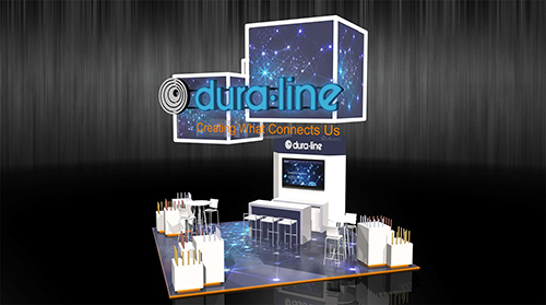
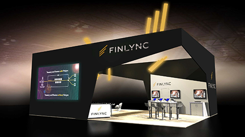
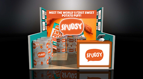
Exhibit Design Tips


With in-person, live trade shows and events now popping up on the calendar,
many companies are looking to redesign their trade show exhibits to debut a
fresh look after the extended time away. After quarantines and closures, businesses
are now coming back to existing exhibits that just don’t represent the
new beginning, especially after many businesses took the opportunity to reset
business practices, marketing, and more. If you are like many other businesses
and are re-considering their old trade show looks, there is no time like the present
to get working on a design that gives your business a fresh new look. Before
your marketing team hits the drawing board, let’s review some important design
tips when planning a new exhibit.
Strategic Messaging
Exhibit messaging must be strategic as exhibitors only have a short time to
capture the attention of their target audience. Whether it is at a busy event or
a trade show, exhibit booths need to be clear in their messaging. Think about
your target audience and the message you want them to receive. Incorporating
simple yet strategic messaging is key to creating an eye-catching, memorable
exhibit design.
On-Brand Aesthetic
Branding is important as it helps to symbolize the company and make it recognizable.
Trade show booths and exhibits should feature brand colors, fonts, and
overall style. If your brand has multiple colors, try to stick to the main colors
for your booth. This will prevent the design from getting too busy. Maintaining
an on-brand aesthetic will keep imaging unified and your business memorable.
Interactive Design
Your exhibit booth can stand out from the rest with interactive features. Whether
it’s a short demo that visitors can check out themselves, a game, or other
interactive elements that lure exhibit-goers in, making your exhibit experiential
for visitors will be a memorable time for them. It will likely stand out as the one
exhibit in which they had fun or that stood out to them. Couple this with on-brand
aesthetic and strategic messaging, and you’ve earned a visitor who will remember
your business long after the event doors have closed.
Clutter-Free Space
Offering things like seating and charging stations are excellent ideas, but be
sure that you have the space organized in a way that is useful. Having too many
amenities can distract visitors from why they’re there — to learn more about
your products and services. You can absolutely offer amenities, but keep your
space clean and uncluttered to attract and retain the most attention. With all of
that said, be sure not to leave your space devoid of attractions. Too much negative/
empty space can make your exhibit booth feel cold and unfinished.
Welcoming Design
The overall design of your exhibit and space should be welcoming. By including
comfort items into your design, you can make your space welcoming, which can
encourage visitors to stay. Things such as padded flooring and seating can offer
a nice respite to those who have been walking on the hard exhibit floors all day.
Choose add-ons that complement your overall design, don’t clutter your space,
and welcome your visitors.
Ready to get started designing your next exhibit?
We’re here to help from start to finish. Contact
us today!
Archives
- July 2025
- July 2021
- June 2021
- May 2021
- April 2021
- October 2018
- September 2018
- August 2018
- July 2018
- June 2018
- May 2018
- April 2018
- March 2018
- February 2018
- January 2018
- December 2017
- November 2017
- October 2017
- September 2017
- August 2017
- July 2017
- June 2017
- May 2017
- April 2017
- March 2017
- February 2017
- January 2017
- December 2016
- November 2016
- October 2016
- September 2016
- August 2016
- July 2016
- June 2016
- May 2016
- April 2016
- March 2016
