Trade Show, Show Business: Put the “Show” Into Your Exhibit
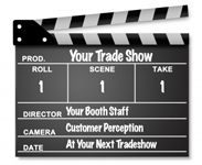
When you are putting together a tradeshow exhibit, think about it as theater. You need to attract an audience, capture their imagination, and leave a memorable impression. To do that you need to set the stage and build an atmosphere that will draw people into your booth – bring them into your show.
 You need a great script and the best actors you can find
If you want great reviews, then you need to start with a great script. Then you need “actors” who can bring that script to life and who can improvise. Give them the perfect costumes and a stage setting that builds on your brand story, and your exhibit will draw prospects right into your show.
Don’t be afraid to be dramatic!
Some of the most imaginative, most successful trade show exhibits are done by companies who offer intrinsically boring products and services. They do not have the luxury of relying on people being interested in what they are selling, so they often work much harder to add entertainment value to their exhibit. These are some of the booths with the most creative themes and visual drama.
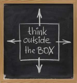
Go a bit outside the box, push the boundaries. Trade show attendees want to see something new and exciting. Just remember to stay consistent with your brand position and brand values.
Lights, camera, action
Well, OK – lights and action! One way to create visual interest is with your lighting design. Work with your designer to build a lighting concept that presents your ideas in a clear way to focus on your company’s competitive advantages. Take it to the next level by using lighting to do more than spotlight your product, use it to create a spotlighted stage for your booth team.
Make your show a tough act to follow
If you create a real show, your exhibit will be the one that people remember when they walk into your competitors’ booth and when they return to their day-to-day business after the show. It will be the one that they talk to their co-workers and associates about. And, perhaps best of all, it will be one of the exhibits that gets press extending your trade show marketing reach.
Trade Show Exhibit Design: “Think outside the box”
I have a friend who always seems to come up with a new, successful angle for every trade show. Recently, I asked her, “How do you do it?” The simple reply, “I always force myself and my team to think outside the box. I challenge everyone involved to do the unexpected and come up with new ways to attract attention and create excitement.”
 I thought about this advice for a moment. It rattled around in my head. At first, I thought, “I always think outside the box.” Then I started to really evaluate what this common expression means. It is an appealing concept, but is it the right approach for every company, for every brand? And did I really always “think outside the box”? Yes, or at least my goal is always to come up with new ideas and “out of the box” solutions. I just never used that expression to describe my efforts.
What is the “box”?
The trade show’s “box” can be big or small. It can have lighting and dramatic banners. It is the expected trade show exhibit, staffed by smiling people representing a company trying to get leads, offering a free gift or a few samples or some sales material. The box is ordinary, stamped out, one after another just the same in different colors. The box is forgettable.
“Outside the box” exhibits
These are the exhibits that give an attendee a new perspective. These are the exhibits that make lasting impressions on the people who see them. To be effective they require more than just being novel, creative ideas; they need to be thoughtful and suitable for the target audience and the brand. Very few trade show exhibits truly rise to this challenge.
Should every company strive to do the unexpected?
As long as the exhibit is consistent with the brand position and brand values, and successfully promotes your products or services, the answer is, “Yes!” It is a real trick to balance inspiring creative with the hard-hitting sales message that this tough economy demands, but when you achieve it, the results can be stunning.
How to get “outside the box” ideas
The first step in creating a breakthrough exhibit is to build a team that shares that commitment. Once you have assembled that team, make sure that they consistently focus on really solving the marketing challenge that faces you in new and interesting ways.
Your trade show exhibit is like a billboard
There are a lot of similarities between a trade show exhibit and outdoor advertising. You are located on a pathway and people are racing by. They glance to the left and to the right. They have a lot of other things to look at. You only have a few moments to attract their attention.  The challenge is very similar to designing a billboard to be placed on a busy Interstate highway.
The best billboards evoke an emotional connection.
They are usually entertaining and often use humor. To be effective billboards must be short, sweet, simple and to the point. Not surprisingly, many of the “rules” for great outdoor advertising design translate to the trade show floor.
- Be relevant or your exhibit will be invisible. Make sure your ads appeal to your target market. Use colors, images and words that will attract them and draw prospects into your exhibit.
- Bright and bold colors are more effective. Bright colors work well, but limit your pallet to two or three at most. Exhibits with multiple bright colors are visually confusing and that reduces the overall effectiveness. Even if you are marketing natural and “green” products, consider using clean blue or bright white rather than the more expected green-brown palette. Green and brown are very likely to recede into the background and have little visual impact unless you compensate for the color palette with other design elements.
- Visibility matters. Make your major exhibit graphics large enough to be seen quickly and from a far distance.
- Use words sparingly and make them easy to read. Use large, legible type. The best bet is solid backgrounds with sharply contrasting type. And unless there is a compelling reason for vertical type, orient your type horizontally – it is easier to read.
- Choose graphics that connect with your target. Select images that will generate the strongest emotion related to your product or service.
Break All the Rules with Your Trade Show Exhibit Design
There are times when the best way to make a visual statement is to break all the rules.
 The “normal” best practice for trade show exhibit design is to make the color scheme consistent with the company’s brand ID color palette. Since so many companies’ color palettes are blue or red, many trade show floors are dominated by the primary colors – blue, red and yellow. If there are “green” products at the show, then add in some green-brown natural-colored booths to the mix. Breaking out of this pattern can make your booth stand out.
Creating a monochrome exhibit is one rule-breaking strategy that can be brilliant if it is well conceived and carefully designed – or a dismal failure if it is not executed flawlessly.
A monochrome color scheme is created in different shades of a single color. If a monochrome display incorporates dramatic shapes, lighting and/or carefully planned contrasting elements, it can be the most memorable exhibit of the show. But if there are no other design elements to create visual interest, it can be boring and attendees will just pass you by.
Does “monochrome” suit your company’s brand personality and product?
A monochrome color scheme is great to use when innovation is a core part of your brand personality. It can be effective for positioning fashion-forward design and high-tech products but is inappropriate for most financial services, insurance, and healthcare products. It is also usually a poor choice if your company is known for products with a wide range of colors – whether it is fashion or candy or stock photography. But if a monochrome color scheme does fit your brand personality and your product, it can be a big win. For example, if you are promoting a new kind of pure water filtration system, then a completely clean, blue exhibit can make a bold statement about both your company and its products.
Will a one-color display stand out?
You want your trade show exhibit to stand out from a distance. Think about what other exhibitors are likely to do. To create visual impact with a monochrome exhibit, it is essential that it is a singular experience on the trade show floor. So if your designer proposes a monochrome exhibit, make sure that the approach is original. One entirely white exhibit could be exciting – two white exhibits are almost guaranteed to be boring.
Consider the scale of your exhibit
A monochrome color palette is most effective for mid-sized and large exhibits. In a small exhibit space, this is not often an effective design approach.
Incorporate other distinctive visual elements
When you limit the color palette to one dominant color, it is essential to compensate with other design elements that add visual interest. You can incorporate one bold graphic element that is the focal point. You can use dramatic lighting to add dimension to the visual presentation. You can incorporate distinctive display components into the display.
Monochrome trade show exhibits are rare, but when executed brilliantly, can be the most memorable exhibit on the trade show floor.
Archives
- July 2025
- July 2021
- June 2021
- May 2021
- April 2021
- October 2018
- September 2018
- August 2018
- July 2018
- June 2018
- May 2018
- April 2018
- March 2018
- February 2018
- January 2018
- December 2017
- November 2017
- October 2017
- September 2017
- August 2017
- July 2017
- June 2017
- May 2017
- April 2017
- March 2017
- February 2017
- January 2017
- December 2016
- November 2016
- October 2016
- September 2016
- August 2016
- July 2016
- June 2016
- May 2016
- April 2016
- March 2016
