Top 10 Tradeshow Display Design Fundamentals
- Study the show’s attendees – know how many are expected and which ones represent prospects for you.
 Know your position in the convention center – the location of your booth as related to the main entrance, the largest exhibits, food and beverage areas or anything else that is likely to impact attendee behavior.
- Think about both long and short range corporate identification – how will prospects find you, and how will they know who you are when they are standing in front of your booth?
- Consider an activity to attract attention – live demonstrations, presentations or other booth activities will cause people to stop and watch.
- Imagine an important prospect approaching your booth – What will they see? How will they be greeted? How much time will they want to spend with you? How will you record their information for follow up?
- Think about the sales process – your booth graphics can be arranged to assist and guide the sales presentation process.
- Consider the image that you want to project – make a list of adjectives that describe your corporate image.
- Think about the practicalities – presentation stations, storage of briefcases, utilities, meeting areas, video, etc.
- Come up with a budget – Not only a number but also what it should include.
- Look for photos – Find some images that are examples of booths you like. Be sure to indicate what it is you like about each particular photo.
Thinking about and preparing these things before you contact an exhibit designer will make the process much easier and more efficient. Best of all, with the right preparation, you’ll end up with a design that fits your style and meets your needs!
Trade Show Success: Integrate Live Online Video
Trade shows have always been great PR opportunities because they get press coverage. For decades, companies have used trade shows to make major announcements or introduce new products. Usually, these announcements get more press coverage than they would ordinarily get because reporters covering the shows are looking for news.
 For the past few years, companies have been extending their news reach by using social media platforms such as Facebook or Instagram to provide live online video of company announcements, news conferences, trade show product demonstrations and other events directly from the trade show floor. All of these platforms incorporate live chat that can be used for “Q and A” sessions between company representatives and reporters, bloggers or the general public.
Now, some companies are cleverly reversing their trade show live streams to bring their entire company to the trade show. Some connect trade show attendees to company executives or technical representatives for live chat events. Other exhibitors are incorporating live feeds of their manufacturing facilities or service centers into their exhibits. The variety is almost endless.
Be Creative
Don’t limit your imagination about how to use live online video. Live video streams can be a great way to promote your exhibit before the show. It can be a great way to present highlights of a show when it is all wrapped up. Live video of product demonstrations and testimonials from the trade show floor can be powerful at generating online sales while the show is going on. If a company representative is making an important presentation at a show, consider how you can use online video of this presentation to promote your company and products.
Consider providing a show cam to your entire team “back at the office” or in the field
Live video can keep your entire company involved with the show. Think about running a daily live stream program from the show just for your company’s staff. It can be as simple as a daily wrap up of the big events from the show and observations of what the competition is up to.
Don’t push the boundaries of the technology too far
Technology can be great but it is no substitute for the live one-to-one contact that trade shows make possible. Make sure that your company is well represented by the people staffing your exhibit.
Plan for everything to go wrong
Live online video can be great but it is not always reliable. Make sure that you coordinate any live stream plan with the show staff and your tech support team. Test everything in advance, and then test it again. Make sure you have a contingency plan and that the live video broadcast is just a plus to your overall promotion and PR plan. The best way to have things go smoothly is to plan for problems.
Have you ever incorporated a live streaming video into your trade show sales effort?
Trade Show Design Secrets: A Brilliant Back Wall
I attend a lot of trade shows. The exhibits are cluttered and sometimes overwhelmed by banners. There is so much stuff that nothing stands out. Most exhibits have no drama. The few that stand out often have brilliantly designed back walls.
 When I design an exhibit, the first thing I think about is how to make a big, powerful graphic statement. For small- to mid-sized booths, it often comes down to creating a brilliant back wall and making it the focal point of the entire exhibit.
Here are a few tips for a brilliant back wall
- Make a color statement: Use bright colors and a limited palette. Generally, feature two or three colors. If you are using color photography, select or modify photos to create a focal color.
- Keep it simple: Make the design visually arresting but simple.
- Eliminate clutter: Do not put anything on or in front of the back wall that isn’t essential.
- Integrate everything with the back wall: Make sure that the other components of your exhibit are compatible with your back wall. If you have a small exhibit, look for ways to incorporate displays, storage, literature racks and even video monitors into your back wall.
- A back wall does not need to be flat. Incorporate curved panels and other 3-D elements into your back wall to create the illusion that your booth is bigger than it really is.
- Fill it with products: Incorporate displays, clothing racks and product showcases to make your back wall more than a graphic backdrop.
- Add unusual materials: Some of the most eye-catching back walls incorporate live plants.
- Lighting really matters: Use backlit signs and displays, pinpoint spots and other light effects to create visual interest and highlight the most important graphic elements of your exhibit.
Nothing about your exhibit should be ordinary but an ordinary back wall is a big missed opportunity.
Trade Show, Show Business: Put the “Show” Into Your Exhibit
When you are putting together a tradeshow exhibit, think about it as theater. You need to attract an audience, capture their imagination, and leave a memorable impression. To do that you need to set the stage and build an atmosphere that will draw people into your booth – bring them into your show.
 You need a great script and the best actors you can find
If you want great reviews, then you need to start with a great script. Then you need “actors” who can bring that script to life and who can improvise. Give them the perfect costumes and a stage setting that builds on your brand story, and your exhibit will draw prospects right into your show.
Don’t be afraid to be dramatic!
Some of the most imaginative, most successful trade show exhibits are done by companies who offer intrinsically boring products and services. They do not have the luxury of relying on people being interested in what they are selling, so they often work much harder to add entertainment value to their exhibit. These are some of the booths with the most creative themes and visual drama.
Go a bit outside the box, push the boundaries. Trade show attendees want to see something new and exciting. Just remember to stay consistent with your brand position and brand values.
Lights, camera, action
Well, OK – lights and action! One way to create visual interest is with your lighting design. Work with your designer to build a lighting concept that presents your ideas in a clear way to focus on your company’s competitive advantages. Take it to the next level by using lighting to do more than spotlight your product, use it to create a spotlighted stage for your booth team.
Make your show a tough act to follow
If you create a real show, your exhibit will be the one that people remember when they walk into your competitors’ booth and when they return to their day-to-day business after the show. It will be the one that they talk to their co-workers and associates about. And, perhaps best of all, it will be one of the exhibits that gets press extending your trade show marketing reach.
Trade Show Exhibit Design: “Think outside the box”
I have a friend who always seems to come up with a new, successful angle for every trade show. Recently, I asked her, “How do you do it?” The simple reply, “I always force myself and my team to think outside the box. I challenge everyone involved to do the unexpected and come up with new ways to attract attention and create excitement.”
 I thought about this advice for a moment. It rattled around in my head. At first, I thought, “I always think outside the box.” Then I started to really evaluate what this common expression means. It is an appealing concept, but is it the right approach for every company, for every brand? And did I really always “think outside the box”? Yes, or at least my goal is always to come up with new ideas and “out of the box” solutions. I just never used that expression to describe my efforts.
What is the “box”?
The trade show’s “box” can be big or small. It can have lighting and dramatic banners. It is the expected trade show exhibit, staffed by smiling people representing a company trying to get leads, offering a free gift or a few samples or some sales material. The box is ordinary, stamped out, one after another just the same in different colors. The box is forgettable.
“Outside the box” exhibits
These are the exhibits that give an attendee a new perspective. These are the exhibits that make lasting impressions on the people who see them. To be effective they require more than just being novel, creative ideas; they need to be thoughtful and suitable for the target audience and the brand. Very few trade show exhibits truly rise to this challenge.
Should every company strive to do the unexpected?
As long as the exhibit is consistent with the brand position and brand values, and successfully promotes your products or services, the answer is, “Yes!” It is a real trick to balance inspiring creative with the hard-hitting sales message that this tough economy demands, but when you achieve it, the results can be stunning.
How to get “outside the box” ideas
The first step in creating a breakthrough exhibit is to build a team that shares that commitment. Once you have assembled that team, make sure that they consistently focus on really solving the marketing challenge that faces you in new and interesting ways.
Your trade show exhibit is like a billboard
There are a lot of similarities between a trade show exhibit and outdoor advertising. You are located on a pathway and people are racing by. They glance to the left and to the right. They have a lot of other things to look at. You only have a few moments to attract their attention.  The challenge is very similar to designing a billboard to be placed on a busy Interstate highway.
The best billboards evoke an emotional connection.
They are usually entertaining and often use humor. To be effective billboards must be short, sweet, simple and to the point. Not surprisingly, many of the “rules” for great outdoor advertising design translate to the trade show floor.
- Be relevant or your exhibit will be invisible. Make sure your ads appeal to your target market. Use colors, images and words that will attract them and draw prospects into your exhibit.
- Bright and bold colors are more effective. Bright colors work well, but limit your pallet to two or three at most. Exhibits with multiple bright colors are visually confusing and that reduces the overall effectiveness. Even if you are marketing natural and “green” products, consider using clean blue or bright white rather than the more expected green-brown palette. Green and brown are very likely to recede into the background and have little visual impact unless you compensate for the color palette with other design elements.
- Visibility matters. Make your major exhibit graphics large enough to be seen quickly and from a far distance.
- Use words sparingly and make them easy to read. Use large, legible type. The best bet is solid backgrounds with sharply contrasting type. And unless there is a compelling reason for vertical type, orient your type horizontally – it is easier to read.
- Choose graphics that connect with your target. Select images that will generate the strongest emotion related to your product or service.
Break All the Rules with Your Trade Show Exhibit Design
There are times when the best way to make a visual statement is to break all the rules.
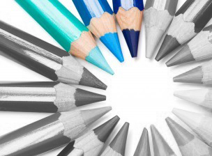 The “normal” best practice for trade show exhibit design is to make the color scheme consistent with the company’s brand ID color palette. Since so many companies’ color palettes are blue or red, many trade show floors are dominated by the primary colors – blue, red and yellow. If there are “green” products at the show, then add in some green-brown natural-colored booths to the mix. Breaking out of this pattern can make your booth stand out.
Creating a monochrome exhibit is one rule-breaking strategy that can be brilliant if it is well conceived and carefully designed – or a dismal failure if it is not executed flawlessly.
A monochrome color scheme is created in different shades of a single color. If a monochrome display incorporates dramatic shapes, lighting and/or carefully planned contrasting elements, it can be the most memorable exhibit of the show. But if there are no other design elements to create visual interest, it can be boring and attendees will just pass you by.
Does “monochrome” suit your company’s brand personality and product?
A monochrome color scheme is great to use when innovation is a core part of your brand personality. It can be effective for positioning fashion-forward design and high-tech products but is inappropriate for most financial services, insurance, and healthcare products. It is also usually a poor choice if your company is known for products with a wide range of colors – whether it is fashion or candy or stock photography. But if a monochrome color scheme does fit your brand personality and your product, it can be a big win. For example, if you are promoting a new kind of pure water filtration system, then a completely clean, blue exhibit can make a bold statement about both your company and its products.
Will a one-color display stand out?
You want your trade show exhibit to stand out from a distance. Think about what other exhibitors are likely to do. To create visual impact with a monochrome exhibit, it is essential that it is a singular experience on the trade show floor. So if your designer proposes a monochrome exhibit, make sure that the approach is original. One entirely white exhibit could be exciting – two white exhibits are almost guaranteed to be boring.
Consider the scale of your exhibit
A monochrome color palette is most effective for mid-sized and large exhibits. In a small exhibit space, this is not often an effective design approach.
Incorporate other distinctive visual elements
When you limit the color palette to one dominant color, it is essential to compensate with other design elements that add visual interest. You can incorporate one bold graphic element that is the focal point. You can use dramatic lighting to add dimension to the visual presentation. You can incorporate distinctive display components into the display.
Monochrome trade show exhibits are rare, but when executed brilliantly, can be the most memorable exhibit on the trade show floor.
5 Ways To Renovate Rather Than Replace Your Trade Show Exhibit
Before you buy a new trade show exhibit, take stock of what you already own and determine if renovation is a better course.
 Rearrange exhibit elements you own to create something new. It is easiest to do this if you own a modular exhibit. But it is possible to switch around parts and pieces of most custom exhibits as well. And don’t forget about unused components that are left over from other old exhibits. Sometimes a combination of parts from two or three booths that have been in storage can be used to create an entirely new booth.
- Refinish or cover worn booth elements. There are countless exhibit refurbishment options. You can have worn aluminum or metal parts re-anodized or powder coated to make them look brand new or transform them into a new color. Exhibit panels can be re-laminated or re-covered to conceal worn surfaces with other materials. You can even have old display panels covered with magnetic graphics.
- Update hardware and lighting. One of the least expensive ways to update your exhibit is to simply update cabinet hardware and replace outdated light fixtures.
- Update the flooring system. You can purchase a whole new flooring system or remodel your existing flooring to create the impression of newness. A new floor can be anything from new, colorful carpet to adding a raised floor.
- Add a few new elements. The most effective way to refresh an outdated exhibit space is to add a few new components —hanging signs and banner, displays, a conference area, desks, You can even incorporate more elaborate tension-fabric structures to revive your exhibit and give it an up-to-date look.
A few smart, simple changes or additions can quickly and affordably give a tired, outdated exhibit a brand new look.
Staff Your Trade Show Exhibit to Make the Sale!
You’ve done everything brilliantly. Your new trade show exhibit has arrived and is set up. Your product displays are stunning. Your agency put together collateral that will impress your prospects. Everything is set for the show opening — or is it?
 The majority of buyers only attend one or two trade shows a year, and they come to the show planning to make buying decisions. Plan ahead so you have the right team to close the sale.
Are you properly staffed?
Most people are aware that having a well-trained trade show exhibit staff is one of the keys to trade show success. But it is just as important to be properly staffed.
Make sure you have the right staffing mix at the show. What functions need to be represented? Do you need technical staff or product specialists to support your sales team? Augment your trade show exhibit team with home office staff who are on call and available to answer questions and provide information to key prospects.
Do you have enough staff to cover the booth?
Even in a small trade show exhibit, it is ideal to have at least two people at your booth all the times so that one person is free to leave the booth and interact with attendees as they are walking by. If you are trapped in your booth waiting for them to come to your trade show exhibit, you will miss key prospects.
Make sure your team maximizes downtime
There is a lot of downtime at a trade show. Some experts estimate that as much as 90% of the time exhibitors spend at a trade show is wasted. Organize lead follow-up activities so that they can be done from the exhibit floor during these idle periods. Send out follow-up emails to prospects. Gather information to answer questions from prospects and get these answers to prospects before the show ends. Meet with the press to generate some proactive PR for your company. Have your team communicate trade show news to key prospects who could not attend the show from the trade show floor.
The right team is the essential element
Put the right team in a great trade show exhibit. Give them the training and tools they need to succeed and you will increase your trade show sales.
Trade Show Exhibit Design: Motion Captures Attention
Few exhibitors use motion to draw visitors to their trade show exhibit, and this presents an opportunity for the exhibitors who do make effective use of motion. Impactful motion can be created in 2-D with digital video or interactive displays, or in 3-D with people or other moving objects.
Effective 2-D Motion Techniques
 Trade show floors are loaded with digital display monitors but they are rarely used to create motion. Most often they are used to show videos of products, digital slide shows or other programming that is meant to be watched from a few feet away. This can be an important element of a booth but may not draw someone into your booth.
To attract passersby place displays above head level and in a location that can be seen easily from at least 10 or 20 feet away. Using large display screens or an array of displays can help make a big statement.
If you want to attract people with something moving, the programming is what really matters. Program your display with attention-getting video or graphics. Use large graphic images, bright colors, stark contrast and incorporate motion.
Effective 3-D Motion Techniques
A few exhibitors have created trade show exhibits that incorporate the latest 3-D technology, but most 3-D motion elements used in trade show exhibits are people or objects that are in motion.
People are the most common 3-D motion elements. A product demonstration filled with activity and animated behavior attracts attention. A performer doing any kinetic activity – dancing, juggling, walking on stilts, and so on – can attract large crowds.
The other common 3-D motion elements are physical objects that move. A motion element can include banners, streamers or tension fabric structures that are well above eye level and in motion.
Effective Use of Motion
Motion elements are highly memorable and can leave a lasting impression with trade show attendees. The most effective way to incorporate motion techniques into a trade show booth is to make sure that the moving element reinforces the brand identity and the booth concept. As with every powerful communications tool, integration is essential to success and using motion elements as a gimmick just to attract attention without properly integrating the message can actually undermine your overall efforts.
Used wisely, motion can attract visitors to your trade show exhibit and has the capacity to build awareness and leave a lasting impression of your company and brand.
Archives
- July 2025
- July 2021
- June 2021
- May 2021
- April 2021
- October 2018
- September 2018
- August 2018
- July 2018
- June 2018
- May 2018
- April 2018
- March 2018
- February 2018
- January 2018
- December 2017
- November 2017
- October 2017
- September 2017
- August 2017
- July 2017
- June 2017
- May 2017
- April 2017
- March 2017
- February 2017
- January 2017
- December 2016
- November 2016
- October 2016
- September 2016
- August 2016
- July 2016
- June 2016
- May 2016
- April 2016
- March 2016
