Do You Have The Best Spot at Your Trade Show?
Establish Goals and a Strategic Plan Before the Trade Show
I believe that the best way to choose a spot is to take the time to study the likely behavior of the attendees. At medical shows, there are normally a large number of educational sessions and the path that the attendees will follow will be into the exhibit hall directly from the meeting rooms.
 Certain other attractions for attendees are worth considering, if there are large dominant exhibitors in the show it may pay off to be close to these booths. Close proximity to catering, lounge areas, restrooms or association booths could also be considerations.
Marketing executives, who have experience in retail, often opt for “end cap” or peninsula booths. These spaces normally have very restrictive rules pertaining to exhibit design that can turn out to be a disadvantage. Sometimes high volume traffic is undesirable. Too many “tire kickers” can distract the booth staff and allow the real prospects to get away.
I have read about a study conducted at a major national show where RFID sensors were placed in the badges of attendees so that traffic patterns and time studies could be analyzed. The area that got the most traffic and held the exhibitors for the longest time was an area just right of center and just a little farther than halfway into the exhibit hall.
In summary, there is no one answer to picking the right spot. You need to establish goals and a strategic plan and then carefully study the entire show/convention schedule to maximize your return.
Attitude is Everything at a Tradeshow
A Positive Attitude Makes a Difference to the Exhibitors
A few weeks ago, I had an opportunity to supervise set up of an exhibit for one of my clients at the National Space Symposium in Colorado Springs. Now this is not a large show, and the exhibits aren’t massive, but the show was pretty cool.
 The products that were being shown were very interesting in their own right, and the fact that the show was held at the Broadmoor Hotel (a world famous 5-star facility) also contributed to the experience. I don’t think the Broadmoor hosts very many trade shows, but in any case, this one has got to be the largest one they do host. The attendees are predominately military or government employees. The exhibit space is spread across two halls, but naturally, all of the exhibitors all want to crowd into the main exhibit hall.
While the hotel and the view of Pike’s Peak is beautiful, in my opinion the most impressive thing about this show was the attitudes of the people working on the showfloor. As set up began, we were all crushed into the main hall. Moving a crate to get to the lid meant moving several crates. The general services contractor (Freeman) struggled to get crates delivered and empties removed. Even in the face of all these difficulties, there was very little stress. I had a problem with the rental carpet that caused a minor delay, which was corrected immediately. The spirit of cooperation and productivity was amazing. Everyone worked hard, was courteous and friendly, and offered to help without being asked no matter which company they were working for.
No one was walking the aisles telling us what we were and weren’t allowed to do. The entire workforce seemed to be thankful for the opportunity to have the work and helped out whenever possible.
I am not sure why attitudes seemed so upbeat, but I can tell you that it makes a big difference to the exhibitors. As cities like Chicago try to find ways to retain trade shows, perhaps they should consider what they can do to change the attitudes of all workers on the show floor.
Tradeshow Lessons from the Mall
It seems like every time my wife and I go shopping at the mall, I get a reminder of what it takes to make exhibiting at a tradeshow a great investment. I think we have all had the same experience – I’m not talking about the big department stores or even the smaller shops that take up most of the space at the mall. I’m referring to the little carts that sit out in the open.
Most of these tiny stores (or kiosks) are staffed by one young person who spends most of their time talking on their cell phone, texting or chatting with friends who stop by. Just like most companies that exhibit at tradeshows, these small businesses are depending on the visual appeal of their products to attract potential customers. While I have no firsthand knowledge of how profitable these carts are, I think it’s safe to say their owners would be thrilled if they could increase sales by 10 – 20% each day.
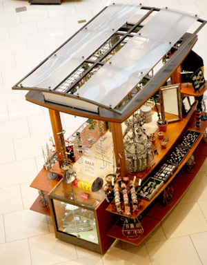 The exception to the rule are the carts that are selling jewelry or eyeglass cleaner. As you walk by, you will almost always be approached by someone who asks, “Excuse me, ma’am, would you allow me to clean your rings?” or “Excuse me, sir, can I clean your eyeglasses for you?.” I would venture to say that the people that work these carts have been given some training and some incentive. Not only that, I’ll bet that they sell much more of their product than the carts staffed by distracted teens.
My personal favorite is the one demonstrating and selling the foam airplanes that come right back to you when you throw them. Usually, two young people are constantly throwing the planes and they always come right back to them. Just the activity alone makes you stand there and watch, which greatly increases the chances you’ll buy something.
So how does all of this relate to trade shows?
Even though the situations are completely different, there is one common factor. The buyers in each case are human beings. Most human beings respond to similar stimulus. Get the people that work your exhibit to approach prospects with as much energy as the people selling jewelry cleaner. Have some activity in your booth like the people throwing foam airplanes. I’ll bet you’ll see a big improvement in your trade show ROI.
Scheduling Tradeshow Staff
Scheduling and keeping track of booth staffers is a vital bit of information that should not be overlooked during tradeshow preparation. Planning should begin well in advance of the show.
A master schedule binder should be created that includes:
- All planned meetings in the booth, including times and attendees
- A list of booth staffer responsibilities, assigning tasks, and a designated time to perform tasks
- A detailed log of times staffers will be in the booth, on break, or dining.
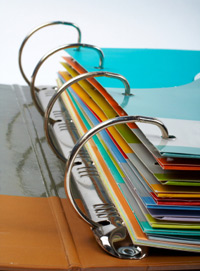 This binder will be most useful if it is kept at the main reception counter for any staffer to view. A master log of meetings should indicate who the attendee plans to see, and what will be discussed. If a private or semi-private meeting is in order, a conference room or sit down area should be available for guests and staff. Log these times accordingly, and block out conference rooms for this time slot. Some exhibit managers will even go as far to know the potential dollar amount in revenues each and every planned visitor could mean to the company. This is incredibly valuable information to share with all booth staffers, so when an important guest walks in, they are treated cordially and respectfully.
Use your schedule to make responsibilities clear to all staff. If a different group of staff is assigned to setting up, or prepping the booth prior to the show, demand that they be there on time. During the show, indicate who will lock up, power down laptops, and secure valuables at the end of the day. Make sure everyone knows who has locking storage keys, and where they are to be found. Have a crew come in early on days two and three, to power-up, check that everything is working, clean-up, and wipe down any dirty areas. Make sure that the booth is absolutely “show ready” ten minutes prior to the show floor opening.
Have a master phone list available in your binder as well. All staffer phones and emails should be easily available to any and all people in the booth. Include arrival/departure times for each staffer, hotel lodging information, and an emergency contact for each staffer. Be sure to have staffers notify someone if they are running late, or may miss a meeting. Someone else may need to cover for them in the event they cannot make an important meeting, otherwise, an attendee may be put-off and not return. Make sure to include anyone hosting or attending a press conference, and, if it is off location, indicate where and in what rooms. It is critical to know where key people are at all times.
It may sound like a bit of extra work prior to the show, and your schedule can be as simple or complex as you choose, but the time spent is well worth the investment. You will find that adding this level of organization will result in a more organized, responsible, and thoughtful staff, better prepared to meet any challenges on an oftentimes hectic show floor.
Top 10 Tradeshow Display Design Fundamentals
- Study the show’s attendees – know how many are expected and which ones represent prospects for you.
 Know your position in the convention center – the location of your booth as related to the main entrance, the largest exhibits, food and beverage areas or anything else that is likely to impact attendee behavior.
- Think about both long and short range corporate identification – how will prospects find you, and how will they know who you are when they are standing in front of your booth?
- Consider an activity to attract attention – live demonstrations, presentations or other booth activities will cause people to stop and watch.
- Imagine an important prospect approaching your booth – What will they see? How will they be greeted? How much time will they want to spend with you? How will you record their information for follow up?
- Think about the sales process – your booth graphics can be arranged to assist and guide the sales presentation process.
- Consider the image that you want to project – make a list of adjectives that describe your corporate image.
- Think about the practicalities – presentation stations, storage of briefcases, utilities, meeting areas, video, etc.
- Come up with a budget – Not only a number but also what it should include.
- Look for photos – Find some images that are examples of booths you like. Be sure to indicate what it is you like about each particular photo.
Thinking about and preparing these things before you contact an exhibit designer will make the process much easier and more efficient. Best of all, with the right preparation, you’ll end up with a design that fits your style and meets your needs!
Trade Show Success: Integrate Live Online Video
Trade shows have always been great PR opportunities because they get press coverage. For decades, companies have used trade shows to make major announcements or introduce new products. Usually, these announcements get more press coverage than they would ordinarily get because reporters covering the shows are looking for news.
 For the past few years, companies have been extending their news reach by using social media platforms such as Facebook or Instagram to provide live online video of company announcements, news conferences, trade show product demonstrations and other events directly from the trade show floor. All of these platforms incorporate live chat that can be used for “Q and A” sessions between company representatives and reporters, bloggers or the general public.
Now, some companies are cleverly reversing their trade show live streams to bring their entire company to the trade show. Some connect trade show attendees to company executives or technical representatives for live chat events. Other exhibitors are incorporating live feeds of their manufacturing facilities or service centers into their exhibits. The variety is almost endless.
Be Creative
Don’t limit your imagination about how to use live online video. Live video streams can be a great way to promote your exhibit before the show. It can be a great way to present highlights of a show when it is all wrapped up. Live video of product demonstrations and testimonials from the trade show floor can be powerful at generating online sales while the show is going on. If a company representative is making an important presentation at a show, consider how you can use online video of this presentation to promote your company and products.
Consider providing a show cam to your entire team “back at the office” or in the field
Live video can keep your entire company involved with the show. Think about running a daily live stream program from the show just for your company’s staff. It can be as simple as a daily wrap up of the big events from the show and observations of what the competition is up to.
Don’t push the boundaries of the technology too far
Technology can be great but it is no substitute for the live one-to-one contact that trade shows make possible. Make sure that your company is well represented by the people staffing your exhibit.
Plan for everything to go wrong
Live online video can be great but it is not always reliable. Make sure that you coordinate any live stream plan with the show staff and your tech support team. Test everything in advance, and then test it again. Make sure you have a contingency plan and that the live video broadcast is just a plus to your overall promotion and PR plan. The best way to have things go smoothly is to plan for problems.
Have you ever incorporated a live streaming video into your trade show sales effort?
Trade Show Design Secrets: A Brilliant Back Wall
I attend a lot of trade shows. The exhibits are cluttered and sometimes overwhelmed by banners. There is so much stuff that nothing stands out. Most exhibits have no drama. The few that stand out often have brilliantly designed back walls.
 When I design an exhibit, the first thing I think about is how to make a big, powerful graphic statement. For small- to mid-sized booths, it often comes down to creating a brilliant back wall and making it the focal point of the entire exhibit.
Here are a few tips for a brilliant back wall
- Make a color statement: Use bright colors and a limited palette. Generally, feature two or three colors. If you are using color photography, select or modify photos to create a focal color.
- Keep it simple: Make the design visually arresting but simple.
- Eliminate clutter: Do not put anything on or in front of the back wall that isn’t essential.
- Integrate everything with the back wall: Make sure that the other components of your exhibit are compatible with your back wall. If you have a small exhibit, look for ways to incorporate displays, storage, literature racks and even video monitors into your back wall.
- A back wall does not need to be flat. Incorporate curved panels and other 3-D elements into your back wall to create the illusion that your booth is bigger than it really is.
- Fill it with products: Incorporate displays, clothing racks and product showcases to make your back wall more than a graphic backdrop.
- Add unusual materials: Some of the most eye-catching back walls incorporate live plants.
- Lighting really matters: Use backlit signs and displays, pinpoint spots and other light effects to create visual interest and highlight the most important graphic elements of your exhibit.
Nothing about your exhibit should be ordinary but an ordinary back wall is a big missed opportunity.
Trade Show, Show Business: Put the “Show” Into Your Exhibit
When you are putting together a tradeshow exhibit, think about it as theater. You need to attract an audience, capture their imagination, and leave a memorable impression. To do that you need to set the stage and build an atmosphere that will draw people into your booth – bring them into your show.
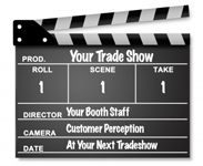 You need a great script and the best actors you can find
If you want great reviews, then you need to start with a great script. Then you need “actors” who can bring that script to life and who can improvise. Give them the perfect costumes and a stage setting that builds on your brand story, and your exhibit will draw prospects right into your show.
Don’t be afraid to be dramatic!
Some of the most imaginative, most successful trade show exhibits are done by companies who offer intrinsically boring products and services. They do not have the luxury of relying on people being interested in what they are selling, so they often work much harder to add entertainment value to their exhibit. These are some of the booths with the most creative themes and visual drama.
Go a bit outside the box, push the boundaries. Trade show attendees want to see something new and exciting. Just remember to stay consistent with your brand position and brand values.
Lights, camera, action
Well, OK – lights and action! One way to create visual interest is with your lighting design. Work with your designer to build a lighting concept that presents your ideas in a clear way to focus on your company’s competitive advantages. Take it to the next level by using lighting to do more than spotlight your product, use it to create a spotlighted stage for your booth team.
Make your show a tough act to follow
If you create a real show, your exhibit will be the one that people remember when they walk into your competitors’ booth and when they return to their day-to-day business after the show. It will be the one that they talk to their co-workers and associates about. And, perhaps best of all, it will be one of the exhibits that gets press extending your trade show marketing reach.
Trade Show Exhibit Design: “Think outside the box”
I have a friend who always seems to come up with a new, successful angle for every trade show. Recently, I asked her, “How do you do it?” The simple reply, “I always force myself and my team to think outside the box. I challenge everyone involved to do the unexpected and come up with new ways to attract attention and create excitement.”
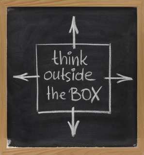 I thought about this advice for a moment. It rattled around in my head. At first, I thought, “I always think outside the box.” Then I started to really evaluate what this common expression means. It is an appealing concept, but is it the right approach for every company, for every brand? And did I really always “think outside the box”? Yes, or at least my goal is always to come up with new ideas and “out of the box” solutions. I just never used that expression to describe my efforts.
What is the “box”?
The trade show’s “box” can be big or small. It can have lighting and dramatic banners. It is the expected trade show exhibit, staffed by smiling people representing a company trying to get leads, offering a free gift or a few samples or some sales material. The box is ordinary, stamped out, one after another just the same in different colors. The box is forgettable.
“Outside the box” exhibits
These are the exhibits that give an attendee a new perspective. These are the exhibits that make lasting impressions on the people who see them. To be effective they require more than just being novel, creative ideas; they need to be thoughtful and suitable for the target audience and the brand. Very few trade show exhibits truly rise to this challenge.
Should every company strive to do the unexpected?
As long as the exhibit is consistent with the brand position and brand values, and successfully promotes your products or services, the answer is, “Yes!” It is a real trick to balance inspiring creative with the hard-hitting sales message that this tough economy demands, but when you achieve it, the results can be stunning.
How to get “outside the box” ideas
The first step in creating a breakthrough exhibit is to build a team that shares that commitment. Once you have assembled that team, make sure that they consistently focus on really solving the marketing challenge that faces you in new and interesting ways.
Your trade show exhibit is like a billboard
There are a lot of similarities between a trade show exhibit and outdoor advertising. You are located on a pathway and people are racing by. They glance to the left and to the right. They have a lot of other things to look at. You only have a few moments to attract their attention.  The challenge is very similar to designing a billboard to be placed on a busy Interstate highway.
The best billboards evoke an emotional connection.
They are usually entertaining and often use humor. To be effective billboards must be short, sweet, simple and to the point. Not surprisingly, many of the “rules” for great outdoor advertising design translate to the trade show floor.
- Be relevant or your exhibit will be invisible. Make sure your ads appeal to your target market. Use colors, images and words that will attract them and draw prospects into your exhibit.
- Bright and bold colors are more effective. Bright colors work well, but limit your pallet to two or three at most. Exhibits with multiple bright colors are visually confusing and that reduces the overall effectiveness. Even if you are marketing natural and “green” products, consider using clean blue or bright white rather than the more expected green-brown palette. Green and brown are very likely to recede into the background and have little visual impact unless you compensate for the color palette with other design elements.
- Visibility matters. Make your major exhibit graphics large enough to be seen quickly and from a far distance.
- Use words sparingly and make them easy to read. Use large, legible type. The best bet is solid backgrounds with sharply contrasting type. And unless there is a compelling reason for vertical type, orient your type horizontally – it is easier to read.
- Choose graphics that connect with your target. Select images that will generate the strongest emotion related to your product or service.
Archives
- July 2025
- July 2021
- June 2021
- May 2021
- April 2021
- October 2018
- September 2018
- August 2018
- July 2018
- June 2018
- May 2018
- April 2018
- March 2018
- February 2018
- January 2018
- December 2017
- November 2017
- October 2017
- September 2017
- August 2017
- July 2017
- June 2017
- May 2017
- April 2017
- March 2017
- February 2017
- January 2017
- December 2016
- November 2016
- October 2016
- September 2016
- August 2016
- July 2016
- June 2016
- May 2016
- April 2016
- March 2016
