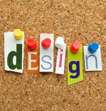
Break All the Rules with Your Trade Show Exhibit Design
There are times when the best way to make a visual statement is to break all the rules.
 The “normal” best practice for trade show exhibit design is to make the color scheme consistent with the company’s brand ID color palette. Since so many companies’ color palettes are blue or red, many trade show floors are dominated by the primary colors – blue, red and yellow. If there are “green” products at the show, then add in some green-brown natural-colored booths to the mix. Breaking out of this pattern can make your booth stand out.
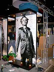
Creating a monochrome exhibit is one rule-breaking strategy that can be brilliant if it is well conceived and carefully designed – or a dismal failure if it is not executed flawlessly.
A monochrome color scheme is created in different shades of a single color. If a monochrome display incorporates dramatic shapes, lighting and/or carefully planned contrasting elements, it can be the most memorable exhibit of the show. But if there are no other design elements to create visual interest, it can be boring and attendees will just pass you by.
Does “monochrome” suit your company’s brand personality and product?
A monochrome color scheme is great to use when innovation is a core part of your brand personality. It can be effective for positioning fashion-forward design and high-tech products but is inappropriate for most financial services, insurance, and healthcare products. It is also usually a poor choice if your company is known for products with a wide range of colors – whether it is fashion or candy or stock photography. But if a monochrome color scheme does fit your brand personality and your product, it can be a big win. For example, if you are promoting a new kind of pure water filtration system, then a completely clean, blue exhibit can make a bold statement about both your company and its products.
Will a one-color display stand out?
You want your trade show exhibit to stand out from a distance. Think about what other exhibitors are likely to do. To create visual impact with a monochrome exhibit, it is essential that it is a singular experience on the trade show floor. So if your designer proposes a monochrome exhibit, make sure that the approach is original. One entirely white exhibit could be exciting – two white exhibits are almost guaranteed to be boring.
Consider the scale of your exhibit
A monochrome color palette is most effective for mid-sized and large exhibits. In a small exhibit space, this is not often an effective design approach.
Incorporate other distinctive visual elements
When you limit the color palette to one dominant color, it is essential to compensate with other design elements that add visual interest. You can incorporate one bold graphic element that is the focal point. You can use dramatic lighting to add dimension to the visual presentation. You can incorporate distinctive display components into the display.
Monochrome trade show exhibits are rare, but when executed brilliantly, can be the most memorable exhibit on the trade show floor.
Design Effective Tradeshow Graphics and Maximize ROI
Graphics Are the Most Important Design Element of Your Trade Show Display
For the vast majority of tradeshow displays, the graphics are the most important design element. No matter how beautiful a display is, if you hang poorly designed graphics on it, it just looks awful. And attractive graphics aren’t enough – they must be effective as well if you want to get the maximum ROI on your tradeshow dollars. In order to get the best graphic design results, you should start by carefully considering your objectives and how your tradeshow display’s graphics might help you achieve them.
 Too often, companies choose to just blow up their logo and a few of their magazine ads or a page from their website, stick them on the backwall and call it a day. People who view a web page or magazine ad spend considerably more time reading and also expect to get complete information from this type of graphic. Tradeshow graphics, on the other hand, need to be read and understood in the 3 seconds that it takes an attendee to walk past your booth.
Let’s consider the graphics on a standard 10-foot backwall display. The normal way to arrange graphics is to put your company’s name and logo on a large sign at the top. This is just fine if your company is Coca-Cola, or Nike, but lesser known brands might want to add a few words that describe what the company does or maybe a bold statement that grabs the attention of the visitor.
Design Graphics to Support Your Sales Presentation
The balance of the graphics in a small booth can be used to create an atmosphere, list features and benefits of products or show products in use. I prefer to design graphics that support a sales presentation. Once a prospect has stopped at your booth, the booth staff can easily do a brief sales presentation using the graphics as visual support.
Once you have established your objectives, it makes sense to take advantage of the experience an exhibit designer brings to the table. Share with them your goals and allow them to provide input on graphics that are going to be displayed.
Trade Show Strategy: Quality Displays Matter
When you exhibit at a trade show, the quality of your display really matters to increase booth impact. A brilliant concept or a great design will fall flat if the booth is poorly designed, manufactured from inappropriate materials or poorly constructed. Smart exhibitors establish very specific quality criteria before they start to work with a design company on their booth.
 How do you define quality?
Quality can be the combination of many factors: design, durable materials, craftsmanship, use of innovative technology, low environmental impact, and so on. Quality is based on your needs, your company’s or organization’s goals and your target customers’ values.
Here are a few things to consider when you develop your exhibit quality criteria.
- Quality Graphic Design
Great graphic design is critical if you want to present your company in the proper light. No matter how much you spend on booth production and construction, if the graphic design is not first-rate, it will not matter. - Specify Quality, High-impact Materials
You may not be able to specify exact materials for your exhibit but you can require that the materials used are high-impact materials that are suitable for the handling, wear and tear you expect for the exhibit. - Review Sample Work to Evaluate Potential Firms
Look at samples of design firms’ work to evaluate each firm’s production quality and attention to detail. - Everything in the Exhibit Deserves Consideration
The quality standards should apply to every part of your exhibit: displays, sales collateral, premiums, even the exhibit staff’s apparel. - Structural Integrity
If your booth exhibit incorporates large, constructed elements, make sure that they are properly engineered to eliminate any risk of structural failure. - Installation and Takedown
Poorly managed installation and dismantling can undermine every investment in quality you make. Make sure you have a professional managing both installation and takedown. - Quality Packing and Shipping
If your exhibit is poorly packed, it is more likely to be damaged in transit. Think about including quality crates or cases in your budget. With proper packaging, your booth will be properly protected when shipped and you many actually save money in the long run by reducing operating labor costs.
Signage at Tradeshows: How Big is Too Big?
All companies that exhibit at tradeshows want their name to be the most prominent in the convention center. At large shows with hundreds of exhibits this is obviously not possible. When you walk into the exhibit hall, you are confronted with sea of visual clutter. So what is the correct approach to signage in your booth?
Consider this:
Exhibit signage breaks down into 3 basic categories, long, medium and short range graphics. Each of these categories serves a practical purpose.
Long Range Graphics
 These are most often corporate identification graphics. In island or peninsula displays, they can be large signs that are placed at the maximum height allowed by the show. They are sometimes suspended from the convention center ceiling (where permitted) or can be supported from the floor on tall columns. The purpose of long range graphics is to allow visitors to locate your exhibit from the entrance of the hall or at least from several aisles away. Most companies want these signs to be as large as possible, so they can’t be too big. When every exhibit has these large signs, they lose their effectiveness. Sometimes adding lighting or rotating the signs will add interest. These types of signs are generally not permitted in backwall displays.
Medium Range Graphics
As visitors get closer to your exhibit, it is important to show them who you are and what you do. At 20 feet away from an island booth, the visitor would need to look straight up to read your large overhead sign, so medium range graphics should include your corporate identification. Individual product names and informative tag lines are appropriate at this level. In smaller displays, medium range graphics are the only corporate identification and should clearly state who you are and what you do. Medium range graphics should be large enough to be read from a reasonable distance but not too large to interfere with the exhibit design. They should be positioned at or just above eye level.
Short Range Graphics
Signs of this nature include any graphic that can only be read while standing in or very near the display. They usually include product or brand identification signs and can include more detailed information since you are conveying information to interested attendees, not trying to lure them to your display. Features, benefits, specifications and installation examples are perfect for short range graphics. These signs do not need to be very large and should be placed just below eye level for ease of view.
While these are very basic guidelines, they will result in well-designed, effective and cost effective exhibits.
Need a unique and effective tradeshow booth idea? We can help you create a custom trade show exhibit that creates a buzz about your brand and increases your booth traffic, all within your budget. Let’s Talk.
Trade Show Design Secrets: Keep It Simple!
What stands out at a major trade show or fair? Bright colors, bold designs, and simplicity. This is not news, yet trade shows remain filled with booths that are too complex and too cluttered – booths that attendees do not recall seeing because they make no impression.
The most common cause of a cluttered booth is trying to accomplish too many objectives. Generally, if you are overly ambitious, you will end up falling short on every goal. But if you are willing to make some choices, your exhibit can be brilliant. Check out Trade Show Exhibit Design: The Creative Brief for some valuable planning tips that will help you to make an impression.
A focused message
 Think about what you really want to communicate with your booth display and write it down. If it is one, focused goal, then you are on the right track. Once you have a singular mission, work with your design team to bring it to life. Focus on your one main message. Carry that message into everything you present at the trade show – your booth, collateral, merchandise presentation, sales pitch, staff clothing, everything.
Keep your booth open and inviting
Eliminate anything and everything that creates a barrier to attendees or will overwhelm them with unnecessary information. A few examples:
- Be clear and straightforward about your company. Don’t tell your complete corporate history – only what is needed to make the sale.
- Present a few products merchandised to showcase your most important products. A booth packed with a deep product assortment will just become clutter.
- Banner graphics can be great unless they are filled with complex graphic images or too many words and logos. If you want people to actually read what is on your banners, limit the amount of information you put on them.
It all sounds so simple, but choices are always difficult.
To create a singular, power statement you have to be willing to make some hard choices. I usually start with an empty space and challenge myself to only put in what is essential. Maybe the product display should only include your newest products. One large multipurpose element can often replace several small elements and eliminate a lot of clutter. Look for ways to build in storage to hide extra sales literature and other supporting materials.
Be remembered.
Your trade show exhibit will be more effective and more memorable if it makes a clear statement about your company and your products. Question everything and, if something does not support your core message, do not let it into your exhibit.
If you want your trade show booth to be the star of the show, you have to have one message and it has to have a chance to be seen.
Archives
- July 2021
- June 2021
- May 2021
- April 2021
- October 2018
- September 2018
- August 2018
- July 2018
- June 2018
- May 2018
- April 2018
- March 2018
- February 2018
- January 2018
- December 2017
- November 2017
- October 2017
- September 2017
- August 2017
- July 2017
- June 2017
- May 2017
- April 2017
- March 2017
- February 2017
- January 2017
- December 2016
- November 2016
- October 2016
- September 2016
- August 2016
- July 2016
- June 2016
- May 2016
- April 2016
- March 2016