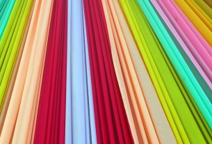
Trade Show Exhibit Design: Tension Fabric Displays
Tension fabric displays have many advantages; they are portable, easy to set up, affordable and inexpensive to update. Many exhibitors have switched to fabric graphics because they eliminate the possibility of glare or scratched, marred finishes. Other exhibitors appreciated the contemporary look that can be achieved with fabric graphics. With all the advantages of using tension fabric, it is no wonder that it has rapidly become commonplace. Unfortunately, commonplace can also become boring on a trade show floor.
Designers get creative with Tension Fabric
The typical tension fabric display is constructed of anodized aluminum tubing covered with a stretch fabric that has been printed with graphics. Most often, the exhibits using tension fabric basically replicate traditional trade show display forms. But now, a few exhibit designers are starting to explore the real potential of lightweight framing, tension fabric, programmed lighting and new printing technology to create some innovative new trade show exhibits that were not possible with traditional materials.
Lightweight framing offers new design freedom
The advent of lightweight aluminum framing means that designers can more freely incorporate tall structures and ceiling-hung elements in booths to increase visibility. It also has enabled designers to cost-efficiently create new freeform shapes and elegant, curved structures. These materials offer almost endless shape and size possibilities. Some designers have even created soaring three-dimensional structures that attendees can enter and be immersed in the brand experience.
Fabric graphics offer versatility
 Fabric graphics offer more versatility than laminated panels, and can be produced in varying textures and opacities. Fabrics can be used to add movement and elegance to banners, and hanging elements. And translucent fabrics printed with opaque ink and illuminated with backlighting can be used to add more dimension to the design.
Graphics can be printed on fabric with either a dye sublimation process or a direct ink jet printing process to achieve different effects. Dye sublimation is a continuous-tone printing technology that very closely replicates a chemical photograph and is the best way to reproduce photographs.
Direct ink jet printing produces sharper, brilliant images and is the best choice for highly graphic images. And, with recent advances in high-resolution ink jet technology, high-quality photographic images can be produced with inkjet printing. This printing method can be used on both synthetic and natural fabrics, and allows designers to create fabric graphics on silk, cotton and fabric blends.
Limitless design possibilities
Fabric is a durable, lightweight, versatile, and affordable medium for trade show exhibit design. It provides designers with countless ways to create fresh and up-to-date displays that can make a trade show exhibit stand out at even the most competitive show.
DOs and DON’Ts for Effective Trade Show Booths
So in the past few weeks we’ve talked about a myriad of trade show topics: how to entertain attendees, how to develop an effective trade show marketing strategy, tips on how to work your booth, how to reduce costs, and ways to plan before leaving for your trade show. Let’s take a few steps back and determine what are a few of the DOs and DON’Ts of pulling together a successful, enticing tradeshow exhibit.
 Preparing for a trade show, especially for small companies, can be a daunting task. Deciding what to include and how to set up an actual exhibit/display is one of the fundamental decisions you’ll have to make. First step is to contact the show managers and find out the size of the booth you will have, whether there is a wall space for your company sign, if there are electrical outlets available, and any other small items that you might be responsible for supplying.
Here are a few other tips to keep in mind when creating your exhibit:
DON’T overstuff it. Product managers might want to display things that represent every brand or product your company offers. Partners might want their logo splashed all over your booth. Keep in mind that sometimes simpler is better. Booths overcrowded with displays, products, stands, etc., turn off prospective attendees and prevent you from quickly communicating why attendees should visit you.
DO simplify your message. Many exhibitors make the mistake of bombarding their booth visitors with marketing slogans. Instead choose the one core message you want to impart to potential customers and stick to that in terms of graphic presentations. Displaying fewer, but larger visual elements in your exhibit will reduce clutter and better garner an attendee’s attention and create a lasting impression.
DO focus on the cream of the crop. Instead of hauling your entire product line to a tradeshow booth and again cluttering your display, overwhelming visitors, and diluting your marketing message, showcase only your new and top-selling products.
DON’T rely on static displays. Any type of motion captures people’s attention as opposed to static displays. You can take advantage of this by playing a looping DVD on a widescreen TV or make use of a rotating display.
DO maintain a small, private area. If your booth is big enough, it’s nice to have a quiet, private area with a table and a few chairs to take attendees or promising prospects that might like to sit down and discuss your company and its product and services in more detail.
DON’T scrimp on carpet. This might sound silly, but after a long day of walking miles and miles on the unforgiving floors of huge exhibit halls, visitors will appreciate booths that have plush, padded carpet. And, so will your booth workers.
Trade Show Design Secrets: Keep It Simple!
What stands out at a major trade show or fair? Bright colors, bold designs, and simplicity. This is not news, yet trade shows remain filled with booths that are too complex and too cluttered – booths that attendees do not recall seeing because they make no impression.
The most common cause of a cluttered booth is trying to accomplish too many objectives. Generally, if you are overly ambitious, you will end up falling short on every goal. But if you are willing to make some choices, your exhibit can be brilliant. Check out Trade Show Exhibit Design: The Creative Brief for some valuable planning tips that will help you to make an impression.
A focused message
 Think about what you really want to communicate with your booth display and write it down. If it is one, focused goal, then you are on the right track. Once you have a singular mission, work with your design team to bring it to life. Focus on your one main message. Carry that message into everything you present at the trade show – your booth, collateral, merchandise presentation, sales pitch, staff clothing, everything.
Keep your booth open and inviting
Eliminate anything and everything that creates a barrier to attendees or will overwhelm them with unnecessary information. A few examples:
- Be clear and straightforward about your company. Don’t tell your complete corporate history – only what is needed to make the sale.
- Present a few products merchandised to showcase your most important products. A booth packed with a deep product assortment will just become clutter.
- Banner graphics can be great unless they are filled with complex graphic images or too many words and logos. If you want people to actually read what is on your banners, limit the amount of information you put on them.
It all sounds so simple, but choices are always difficult.
To create a singular, power statement you have to be willing to make some hard choices. I usually start with an empty space and challenge myself to only put in what is essential. Maybe the product display should only include your newest products. One large multipurpose element can often replace several small elements and eliminate a lot of clutter. Look for ways to build in storage to hide extra sales literature and other supporting materials.
Be remembered.
Your trade show exhibit will be more effective and more memorable if it makes a clear statement about your company and your products. Question everything and, if something does not support your core message, do not let it into your exhibit.
If you want your trade show booth to be the star of the show, you have to have one message and it has to have a chance to be seen.
In a Blink of an Eye, a Trade Show Decision is Made
Swarms of attendees are in the aisles, but who will come into your booth? Is one of the attendees your next big prospect? They could be…
The bestselling book, Blink: The Power of Thinking Without Thinking, by Malcolm Gladwell, informs us:  “A person watching a silent two-second video clip of a teacher he or she has never met will reach conclusions about how good that teacher is that are very similar to those of a student who has sat in the teacher’s class for an entire semester. That’s the power of our adaptive unconscious.”
Considering the implications of this in trade show terms, here are some items to be aware of in working with buyers and prospects in your exhibit and creating the best possible impression.
The snap judgments derived in those seconds will determine whether someone perceives you worthy of their time. And whether they will move towards any type of engagement.
When you are creating your booth property you must remember that it will be placed in a sea of other sights and sounds. How do you create a physical structure that is welcoming and delivers your core marketing message to the trade show audience? Not an easy task.
Can your booth live up to its marketing potential? Here are a few questions your team should consider as you prepare for the show.
- Will a person who is unfamiliar with our company know who we are and what we do via our graphics?
- Do we clearly communicate our solution message in our booth in images and text?
- Is your booth open and inviting so that someone is drawn into it?
- How can you tactfully interrupt someone who is walking the aisle and engage them with video, music, graphics, a demonstration, etc.?
We know that most attendees come to the show with an agenda, and use the time to evaluate vendors before making a final decision. When a buyer is in the information gathering mode, as is generally the case at an event, there is a relatively small window of opportunity to grab their attention. What happens is they use this time to count in and leave out suppliers based upon their experience in the booth with them.
Starting the Conversation with a Prospect
Let’s assume that your booth has caught the attention of someone walking the aisle. The first step in any engagement process is a conversation. It is conversation which is focused on the attendee, not you.
Do not start the conversation with, “Can I help you?” This is an immediate turn-off! Use open- ended questions to probe if this person is a prospect at all.
The best booth personnel don’t sell, instead they “gather” the information on what type of prospect they are engaging. Gathering information is the opposite of selling.
Start the conversation with a “pick up line” that will solicit a thoughtful reply, like one of these:
- What conference session has been the best one, thus far?
- Wasn’t the [keynote speakers name] funny, entertaining, etc. What did you think of him/her?
- What booth on the floor has been the most compelling for you?
- What’s the best thing you’ve seen at the show?
What are the qualifying questions that let YOU determine if they are a prospect for you? If you get these questions answered, then you know where to take it from there!
Once you have the conversation started, then you can ask other open-ended questions which can help you qualify them. Here are some examples for you:
- What’s your biggest challenge this year?
- What did you hope to find at the show?
Now that you have their attention…are they someone you want to talk to? Ask a question about THEIR responsibility at the company. Like:
- “Are you responsible for _________”
If no…ask “who is?” - “Are you involved with _________”
They may be a source of information about potential projects. If they are not the right person, don’t waste another second with this person while potential “hot” prospects are walking by the booth. Escort this person out of the booth quickly and politely so you can engage with the right prospect.
Now if you find a decision-maker for your target company-type…take it a step further and find out if a project is on the horizon by asking:
- “Is your company planning a __________?”
- “Have you chosen a vendor?”
- “When will you make that decision?”
- “What are the criteria for ______?”
- “What is the budget for ______?”
The questions you are asking should match the lead gathering device the booth personnel have. You could be using a lead card, an electronic device, or a handheld smart phone to capture relevant information. Make sure all members of your booth team know what pieces of information you want gathered and someone is monitoring for quality.
By gathering as much information and recording it on the show floor, it will make the follow- up process more robust. In a future post we will discuss several proven follow-up activities that can separate you from the competition and move the prospect along the sales funnel.
Archives
- July 2025
- July 2021
- June 2021
- May 2021
- April 2021
- October 2018
- September 2018
- August 2018
- July 2018
- June 2018
- May 2018
- April 2018
- March 2018
- February 2018
- January 2018
- December 2017
- November 2017
- October 2017
- September 2017
- August 2017
- July 2017
- June 2017
- May 2017
- April 2017
- March 2017
- February 2017
- January 2017
- December 2016
- November 2016
- October 2016
- September 2016
- August 2016
- July 2016
- June 2016
- May 2016
- April 2016
- March 2016
